
.svg)

Branding isn’t just about having a nice logo or some pretty colors. It’s about how people feel when they see and interact with your business. The truth is, every design choice you make — from the shade of blue you pick to the font you use — shapes the way people perceive you.Here’s the thing: people make snap judgments. In just a few seconds, your design can either build trust and curiosity, or cause doubt and hesitation. A strong brand doesn’t just look good, it feels right. And when it feels right, it sticks.In this article, let’s break down the psychology of branding and how your design decisions can shape the way people see (and remember) your brand.
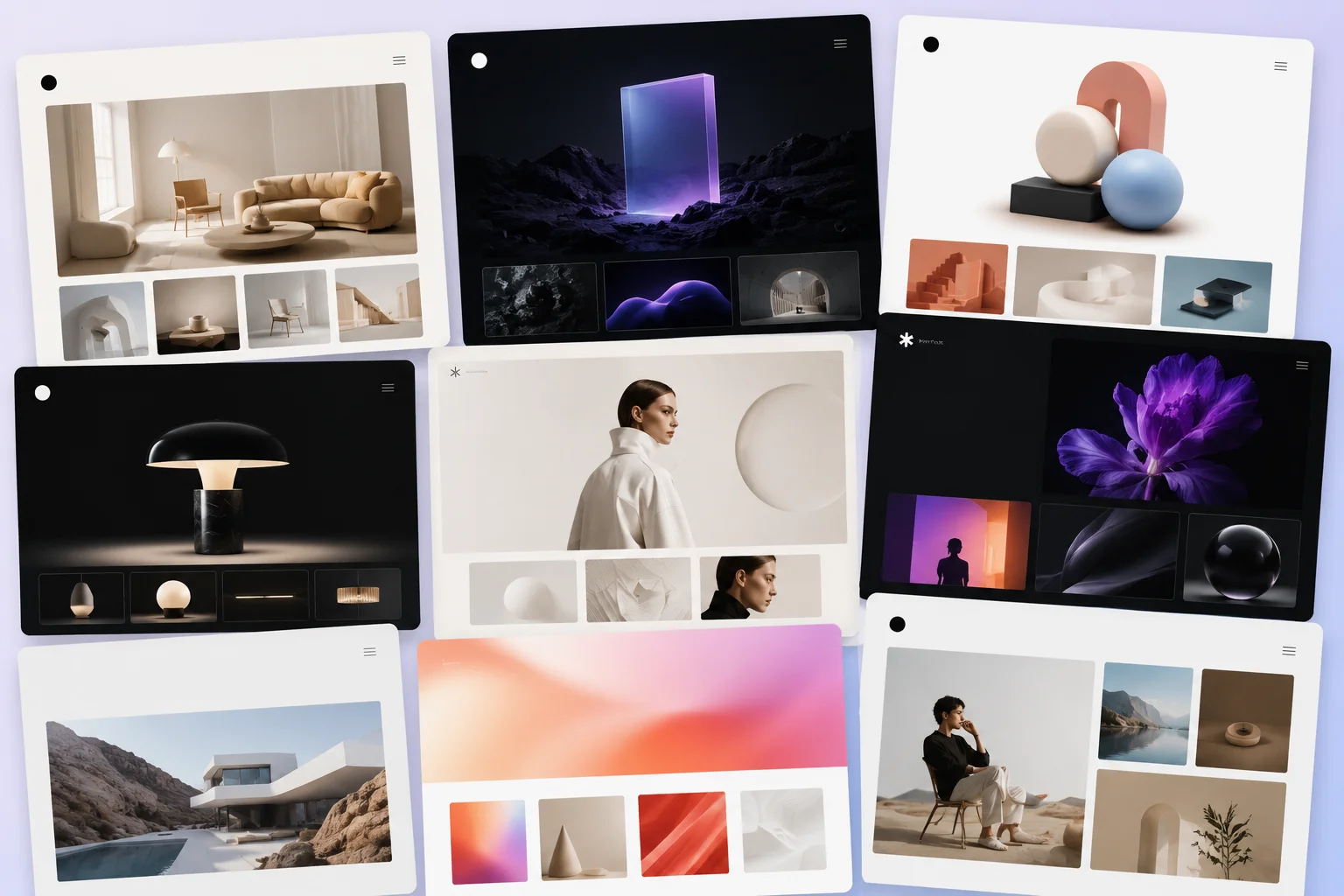
First Impressions Matter
We all know first impressions are powerful, and online they happen even faster — studies show people form an opinion of a website in under 50 milliseconds. That’s basically the blink of an eye.So what does this mean for your brand? It means the moment someone lands on your site, sees your logo, or scrolls past your ad, they’re already deciding: “Do I trust this? Do I like this? Does it feel professional?”A polished design instantly communicates credibility. A messy or outdated one makes people hesitate. Think about the difference between stumbling onto a sleek, modern homepage versus one that looks like it hasn’t been updated since 2009. One gives confidence, the other… not so much.Your design is your handshake. And in psychology, first impressions are “sticky” — once people form one, it’s hard to change.
The Power of Color Psychology
Colors aren’t just decoration — they trigger emotions. That’s why you see certain industries stick to certain palettes:Blue → trust, reliability, stability (banks, tech, social media).Red → excitement, urgency, appetite (food brands, retail sales).Green → growth, health, balance (eco-friendly, wellness).Yellow → optimism, creativity, energy (brands that want attention fast).Think about how many social media platforms are blue — Facebook, Twitter/X, LinkedIn. It’s no accident. Blue tells us “safe, trustworthy, familiar.”When you pick your brand colors, you’re not just choosing what looks nice — you’re deciding what people feel when they see your business.
Typography Speaks Without Words
Fonts might not seem like a big deal, but they set the tone before anyone reads a single word.Serif fonts (think Times New Roman) → tradition, authority, trust.Sans-serif fonts (like Helvetica) → modern, clean, straightforward.Script fonts → creativity, personality, elegance.Imagine a law firm with playful, curly script fonts — would you feel like they could handle your case? Probably not. Now imagine a creative agency using only rigid serif fonts — doesn’t exactly scream innovation.Typography is silent, but it’s powerful. It sets expectations the moment your audience lands on your site.
Consistency = Trust
Here’s a fun psychological principle: the mere-exposure effect. Basically, the more we see something, the more we trust and like it.That’s why consistency in branding matters so much. If your colors, fonts, and tone match across your website, social media, and marketing materials, people recognize you instantly. It feels familiar, and familiarity builds trust.But if your Instagram looks totally different from your website, or your logo changes style depending on where it appears, people get confused. And confusion is the enemy of trust.The takeaway: consistency isn’t boring — it’s credibility.
Visual Hierarchy and Layout
Design isn’t just about what’s on the page, it’s about what people notice first. Our brains are wired to scan before we read, so the way you structure your layout matters a ton.Good hierarchy makes your design feel effortless: the headline grabs attention, the subhead explains, the CTA button stands out, and supporting visuals reinforce the message. Bad hierarchy? It forces people to work too hard — and most won’t bother.When your design is easy to scan, people subconsciously think, “This brand is clear, organized, and trustworthy.”
Storytelling Without Words
At the end of the day, branding is storytelling. And design is one of the best ways to tell that story without saying a word.Think about it:A fitness brand with bold colors, strong fonts, and dynamic images → energy and motivation.A luxury brand with muted colors, elegant serif fonts, and lots of whitespace → sophistication and exclusivity.Every design choice, from your logo to your layout, tells people who you are and what you stand for. When your visuals align with your story, people don’t just understand your brand — they feel it.
Conclusion
Branding psychology isn’t about tricking people. It’s about aligning the way your brand looks with the way you want people to experience it.Every choice — your colors, your fonts, your layout, your consistency — sends a signal. Get those choices right, and you don’t just create a brand that looks nice. You create one that feels right, builds trust, and sticks in people’s minds.And that’s the real power of branding: shaping perception in a way that turns casual visitors into loyal customers.Want to build a brand that not only looks good but feels right? Let’s work together.


.svg)