
.svg)
Most websites don’t fail because of bad design — they fail because they were built without structure. I see it all the time: beautiful visuals, smooth animations, clean typography… and yet the site doesn’t convert. Visitors scroll, hesitate, and leave. Not because the product is weak, but because the experience doesn’t guide them toward action. A high-converting Webflow site isn’t about adding more features or trendier effects. It’s about building your project in the right order — with strategy first, design second, and conversion always in focus.
In this guide, I’ll break down the exact framework I use to structure Webflow projects that consistently drive engagement, generate leads, and scale with growing businesses. You’ll also get a practical checklist you can apply to your next build immediately. If your current site looks good but isn’t producing real results, this will show you why — and how to fix it.
Quick Answer: What is the best structure for a high-converting Webflow project?
A high-converting Webflow project follows this structure:
1.Strategy & goals
2.User & market research
3.Page architecture (clear content flow)
4.UX-focused design & interactions
5.Conversion optimization & testing
When these five stages are followed in order, websites consistently see higher engagement, lower bounce rates, and more qualified leads. This guide breaks down each step with a practical checklist you can apply immediately.
Why Most Websites Fail to Convert
Most websites don’t fail because of bad visuals — they fail because they skip structure. Teams jump straight into Figma, skip strategy, rush development, and end up with a site that looks good but doesn’t guide users toward action. In every successful Webflow project I’ve worked on, conversion was designed before the first pixel was placed.
Step 1: Start With Strategy (Before You Touch Design)
The strategy phase is where you define what the website needs to achieve for both the business and the user. This creates a clear direction before design or development begins.
Start by identifying the primary business goal, whether that is generating leads, increasing signups, driving sales, or booking calls. Then define the primary user goal by understanding what problem visitors are trying to solve when they arrive.
From there, establish one main call to action for each page so users know the next step to take. Finally, choose success metrics such as conversion rate, time on page, or form completions to measure performance.
A strong strategy should result in a clear conversion goal, a defined target audience, one focused CTA per page, and measurable success metrics.
Step 2: Research & User Understanding
Research removes guesswork and prevents design decisions based on assumptions. It helps you understand what users need, what competitors are doing well, and where opportunities exist.
Start by reviewing a few competitor websites to see what works and where users may experience friction. Identify common user pain points or objections that could create hesitation, and look for content gaps where important questions are not being answered clearly.
Also pay attention to UX issues on similar sites, such as confusing navigation, weak calls to action, or cluttered layouts.
A simple starting point is to analyze three to five competitor sites, list top user objections, and identify gaps your website can improve on.
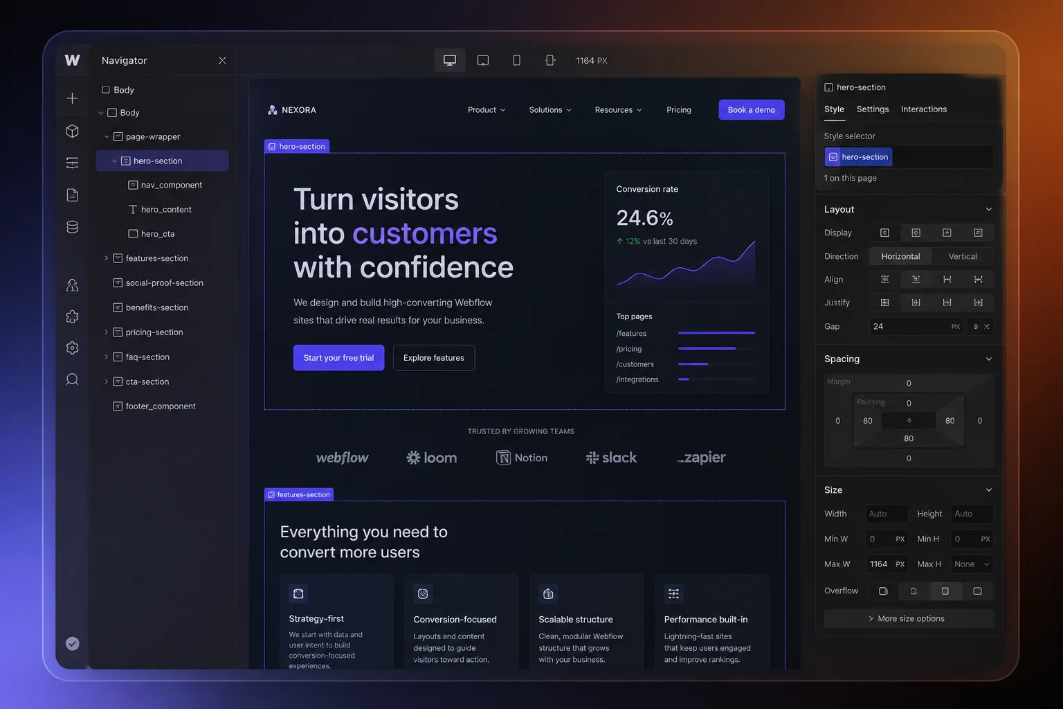
Step 3: Page Structure That Drives Action
A conversion-focused page performs best when it follows a clear and predictable psychological flow. Rather than overwhelming visitors with too much information at once, each section should naturally guide them toward taking action.
The page should begin with a strong hero section that immediately communicates the value of the product or service. This area should include a clear value proposition, one primary call to action, and a strong supporting visual that reinforces the message.
After the hero section, social proof should appear early on the page to build trust. This can include client logos, testimonials, reviews, or key metrics that show credibility and results.
Once trust is established, the page should focus on benefits before features. Instead of leading with technical details, explain how the product helps the user, what problem it solves, and why it matters to them.
As users continue scrolling, include a secondary call to action for visitors who are ready to move forward after learning more.
Next, address common objections that may prevent someone from converting. This can be done through FAQs, guarantees, or a simple explanation of how the process works.
Finally, end the page with one last call to action followed by a clear footer navigation, making it easy for users to either convert or continue exploring the site.
As a final check, make sure the page has a clear above-the-fold message, social proof appears early, benefits are explained before features, and there are at least two opportunities for users to take action.
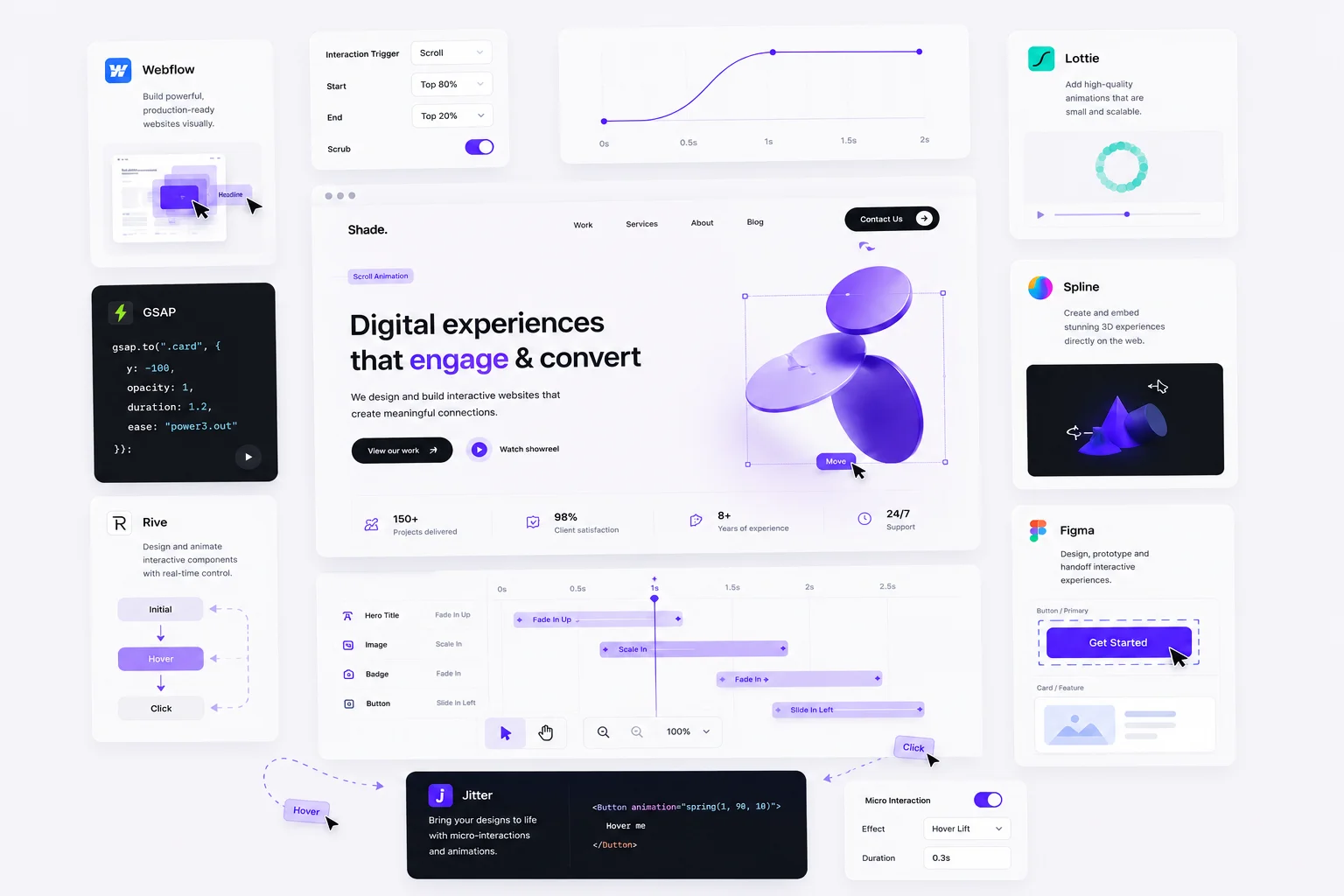
Step 4: Webflow UX & Interaction Best Practices
Use interactions to guide attention, not distract from it. When used well, motion can improve clarity and help users move through a page more naturally.
Subtle scroll animations can reveal content as users move down the page, creating a smoother experience without feeling overwhelming. CMS collections are valuable for scalable content such as blogs, case studies, or team pages, making updates faster and more efficient.
Lightweight micro-interactions on buttons and calls to action can make the interface feel more responsive and polished. At the same time, performance should remain a priority through optimized image loading and clean builds.
As a final check, make sure animations support content hierarchy, repeatable sections use the CMS, the mobile experience is fully tested, and site speed is optimized.
Step 5: Conversion Optimization & Testing
Conversion optimization is what turns good design into real business results. A website may look polished, but small improvements in key areas often have the biggest impact on performance.
Start by improving headline clarity so visitors immediately understand what you offer and why it matters. Review CTA wording and placement to make sure buttons are clear, action-driven, and easy to find throughout the page.
Forms should also be simplified by reducing unnecessary fields and making instructions easy to understand. The easier it is to complete, the more likely users are to convert.
Finally, review the mobile experience carefully. Many users will visit from their phone, so navigation, readability, speed, and button usability all need to feel seamless.
As a final check, make sure headlines are clear, CTAs are action-focused, forms are frictionless, and the mobile experience has been fully reviewed.
The Complete High-Converting Webflow Project Checklist
✔ Clear conversion goal
✔ Defined audience & messaging
✔ Research-driven content structure
✔ Strategic page flow
✔ UX-focused interactions
✔ Performance optimization
✔ Conversion testing


.svg)