Adidas Mobile App Experience.
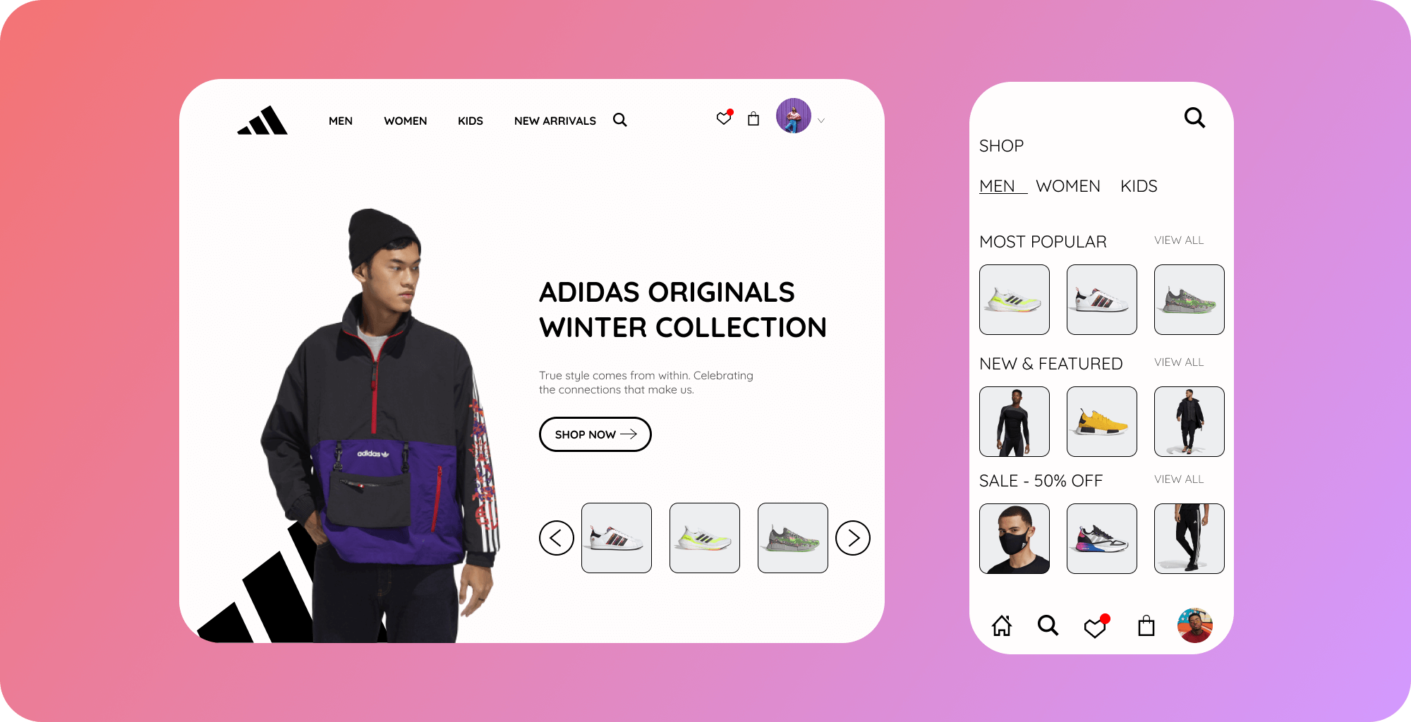
Background
During the last few months, and due to the covid pandemic, I have moved my shopping
habits to online rather than in-person shopping. I set up accounts across my favorite
clothing stores like Nike, urban outfitters, Zumiez, Vans, and
Adidas. I found the Nike
app to be the most intuitive/rewarding to use and due to Adidas market value, I would
assume their app would be the same. However, after integrating the Adidas app into
my day-to-day shopping habits,
some features felt very cumbersome to use. So I
finally scratched my itch to redesign the app. The redesign was unsolicited, so it’s
strictly based on my experience with the iOS platform as a user and a designer.
Since I did
not have access to user data and/or research about Adidas’ current
design, I did my best to think through every single detail and keep the overall
feel of the app intact.

😕 Problem
Despite using the Adidas app regularly to shop, I had trouble navigating through
its menu. I struggled finding my favorites, recent purchases, or viewing specific
items. After observing that other people also experienced issues
with the app,
I pursued this redesign as an opportunity to improve the user experience in any
way I could.
😏 Personal Objectives
I had two main motives for this case study:
Facilitate a better user experience for Adidas' app by improving its UI.
Take full ownership of the various roles involved in designing a product
such as, User Researcher, User Experience
Designer, and Product Designer.
🚀📈 Brand Analysis and User Research
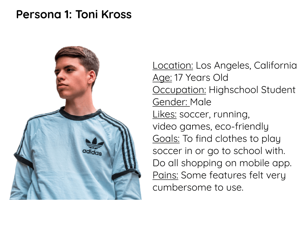
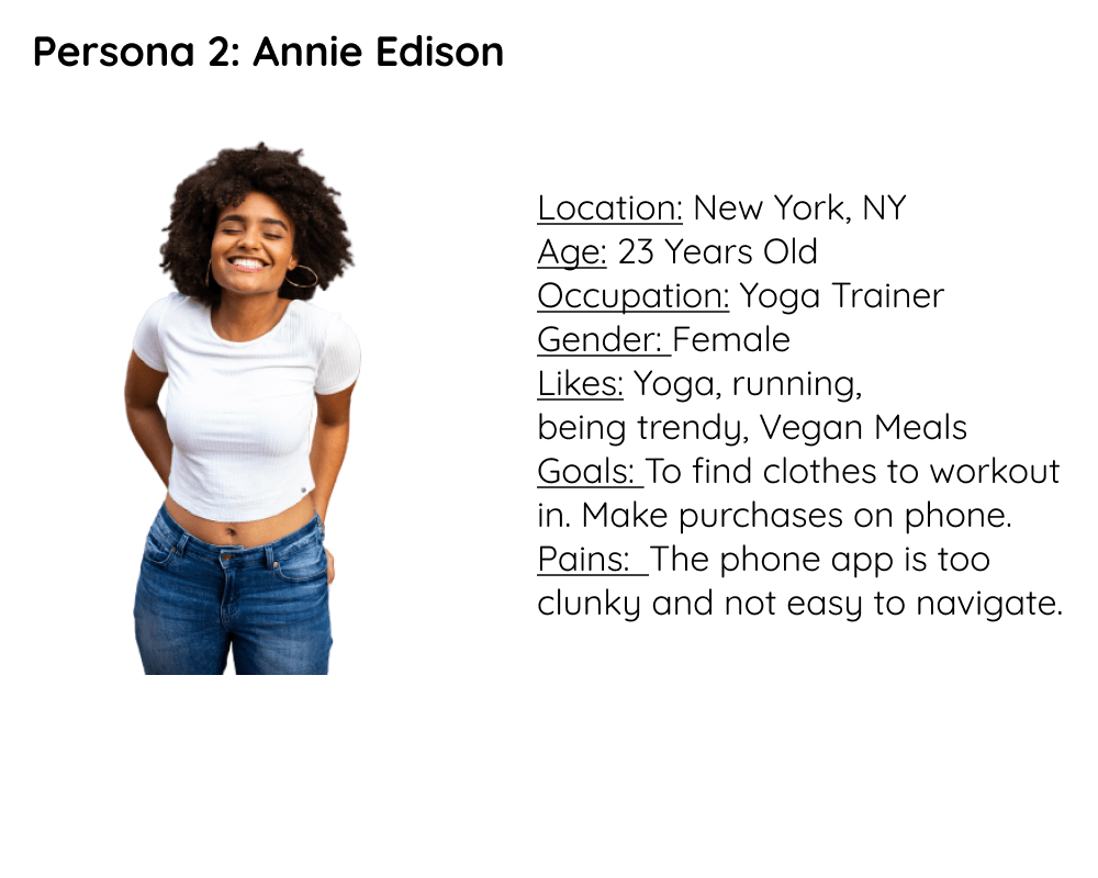
Adidas’ target audience falls within the 20- to 29-year-old age group.
People who are athletes or are passionate about sports and this
segment are considered as the strongest consumer market. The
company is focused on targeting
and strengthening its brand
with the next generation of athletes in the 14- to 19-year-old
age group. According to Adidas Group, Adidas is primarily
targeting sports participants, including those at the highest
level of
their sport, as well as non-athletes who are inspired
by or really love sports. Adidas has a long history of providing
athletic footwear and apparel for athletes at all levels.
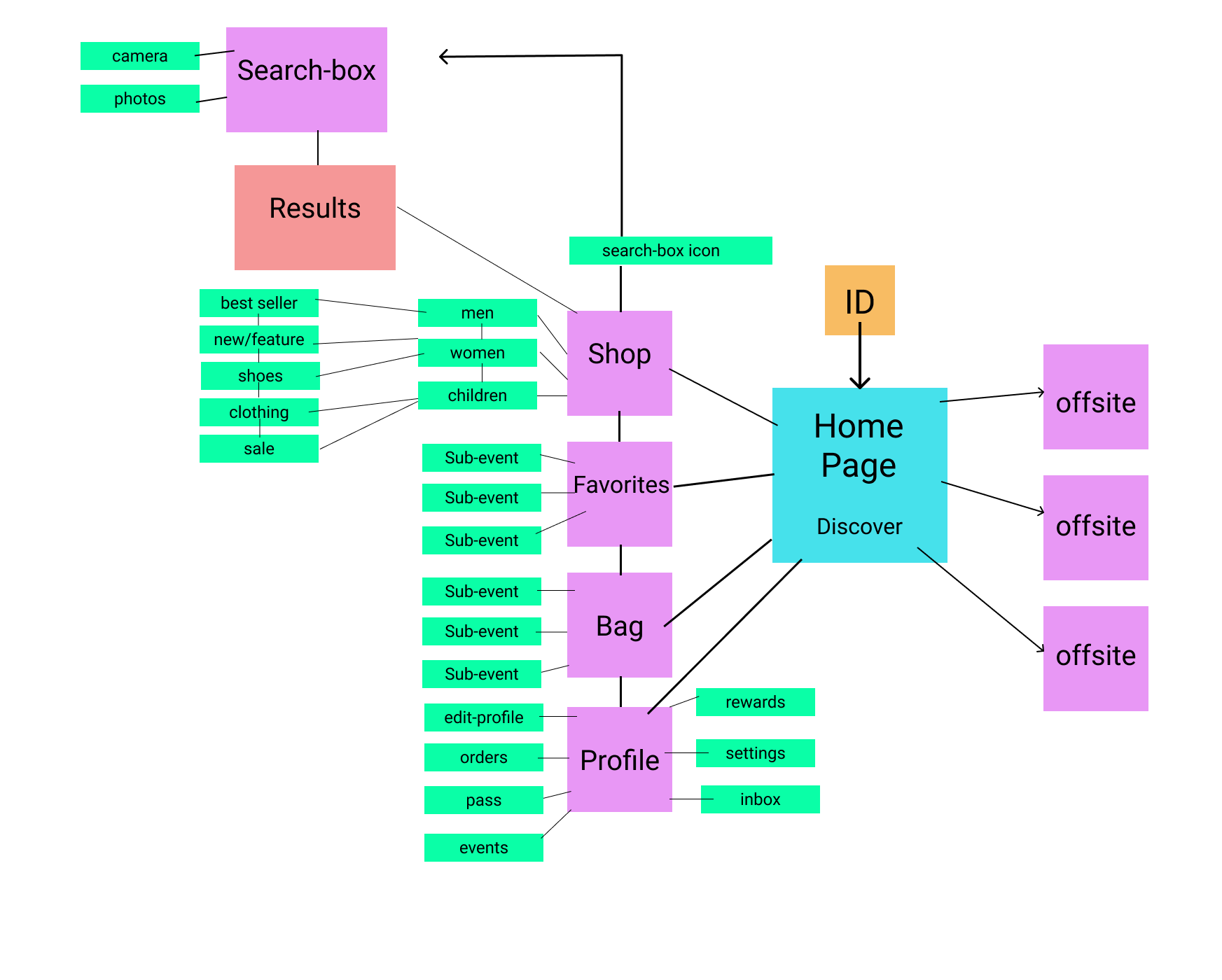
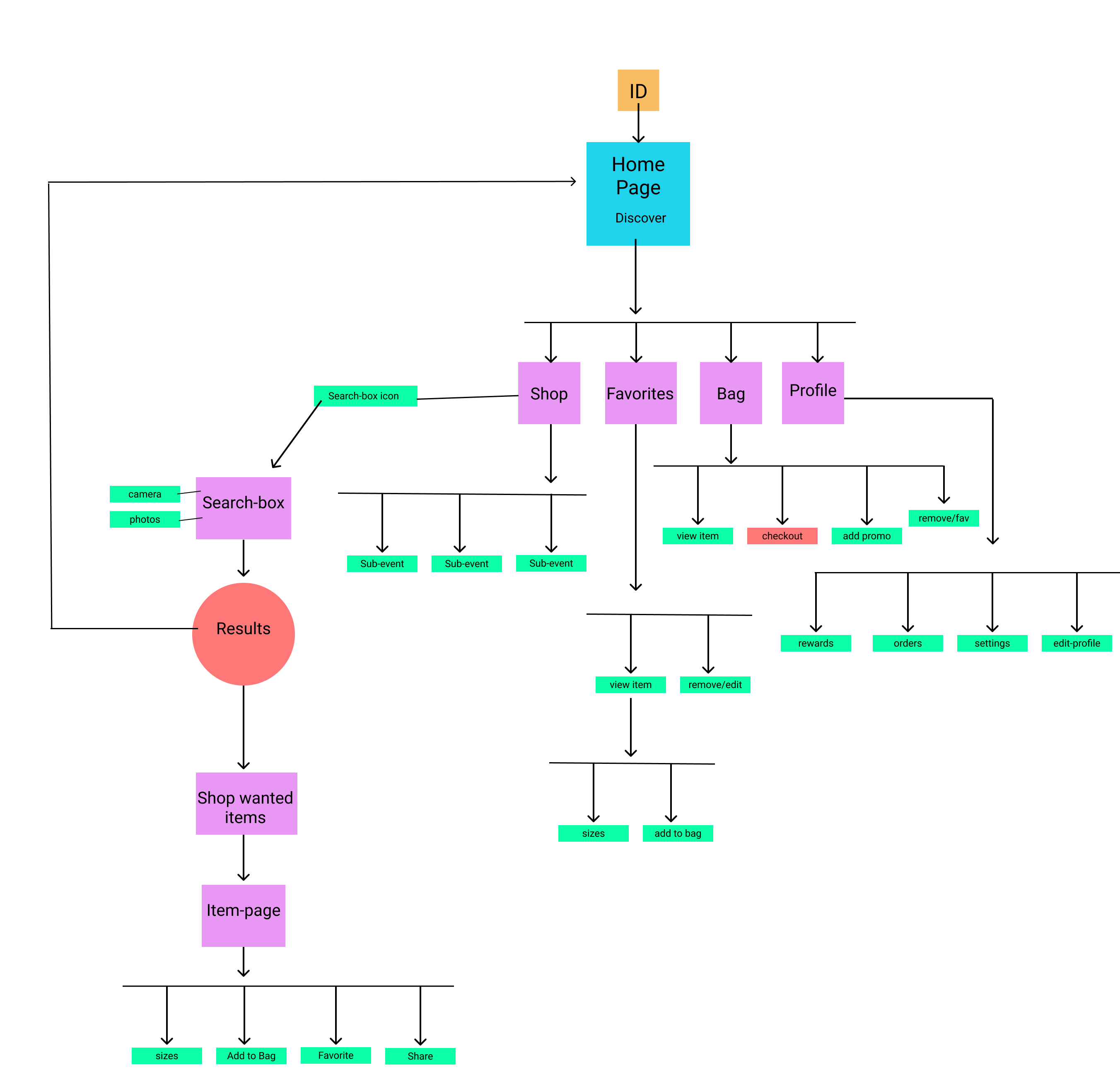
Mapping Content
🐵 Guerilla Usability Testing
To test the app's user experience, I surveyed various people across
the Los Angeles area and asked them to perform a few predefined
tasks in the IOS app as I recorded their actions and took notes.
Some of the tasks/questions
were:
- Find my recent purchases
- Find the most popular items
- Try to save a product you like but don't want to buy right away.
- Navigate to my wishlist/favorites.
- What do you want to see when you first open the app?

Mapping Interaction
Wireframe/Prototyping
✨ Reflections on my work here

What started out as the problem of “Why is this app so hard to use?”
Turned into a month-long endeavor into understanding how the
simplest of actions can be made difficult/frustrating with poor
design. Although I underestimated
how much work would go
into redesigning the Adidas app and understanding the nuances
of various use cases and workflows, this project was a great
opportunity for me to test myself and hone the design skills
I’ve learned
throughout my various courses.