
.svg)
.svg)
Turning first-time users into active members
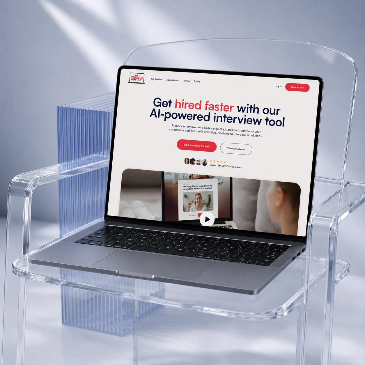
My Interview Practice is an AI-powered interview platform designed to help users prepare for real-world interviews through interactive video and audio simulations. The platform allows users to practice interviews tailored to specific roles, receive AI-generated feedback, and improve communication, confidence, and interview performance through guided preparation experiences.
Despite strong interest in the product, many new users were dropping off before completing their first interview experience. The onboarding flow introduced too many decisions too early, making it difficult for users to quickly understand the platform’s value and confidently get started.
The dashboard also lacked clear direction for first-time users, especially across free and paid experiences. Important actions, upgrade paths, and interview options competed for attention, creating friction during the most critical stage of the user journey.
The goal was to create a more guided and activation-focused experience that reduced cognitive load, simplified onboarding, and helped users reach their first successful interview faster.
.webp)
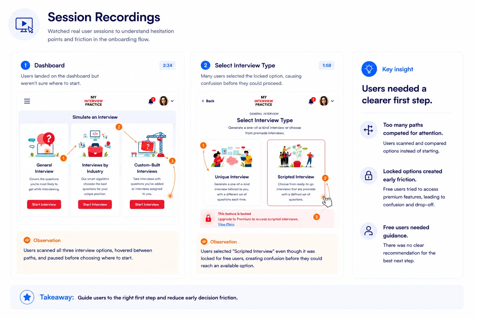
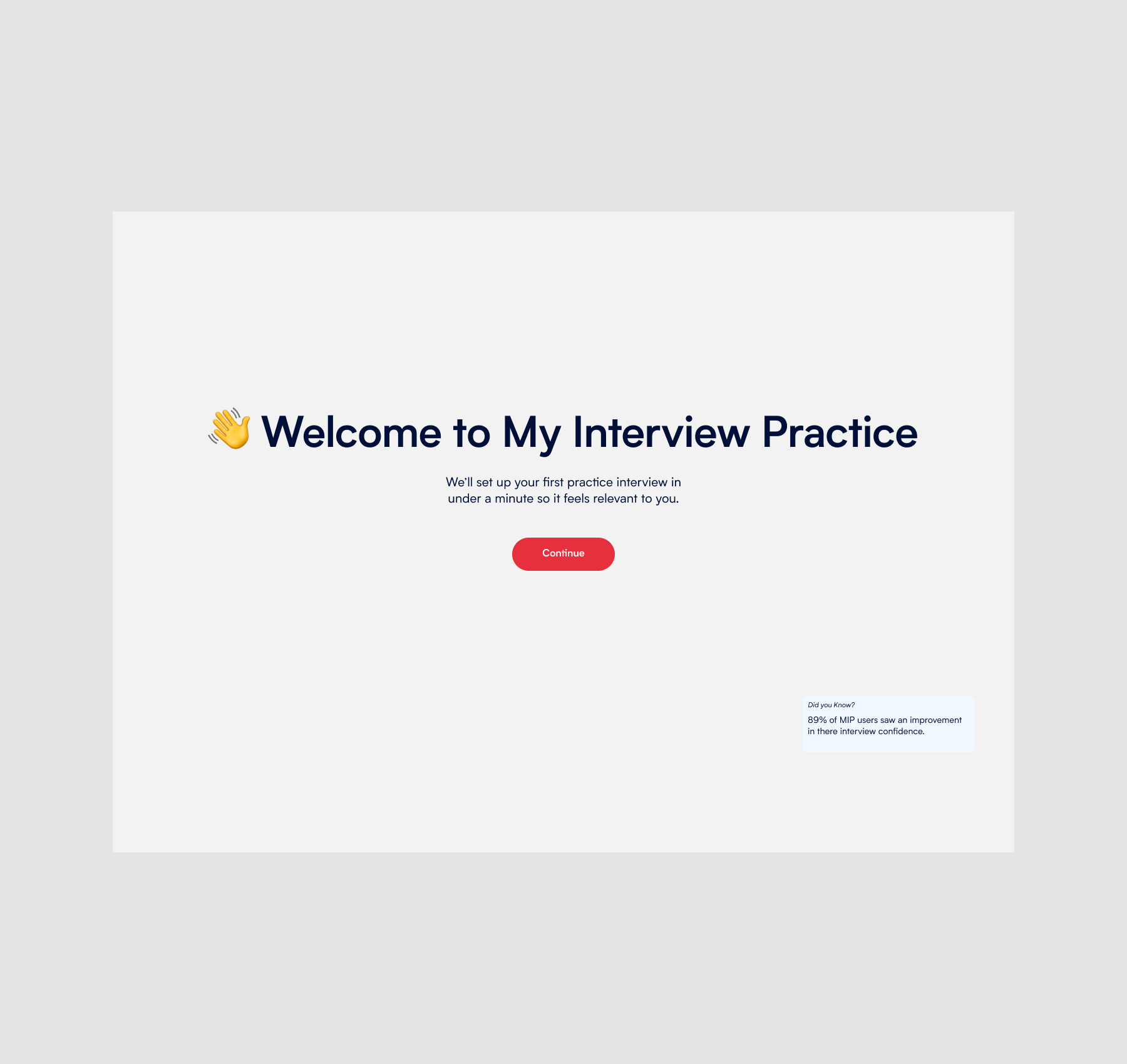
The original onboarding experience introduced too many decisions too early. New users were immediately presented with multiple interview paths, setup steps, and feature options before fully understanding the product’s value.
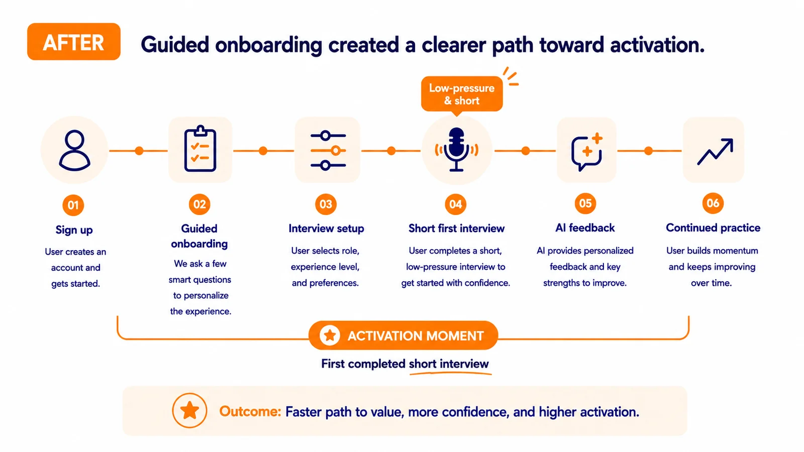
Instead of optimizing for exploration, the strategy shifted toward activation — helping users reach their first successful interview experience as quickly and confidently as possible.
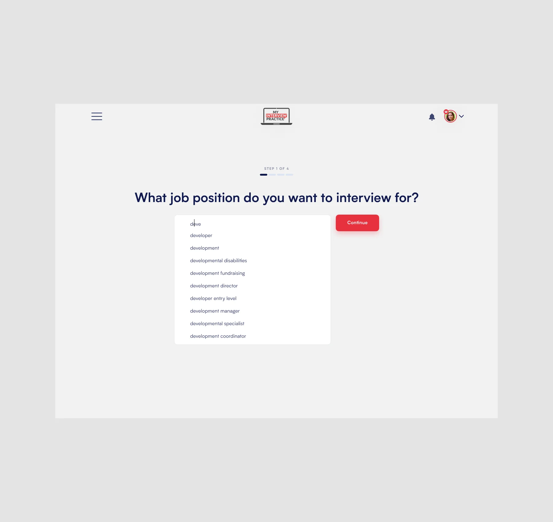
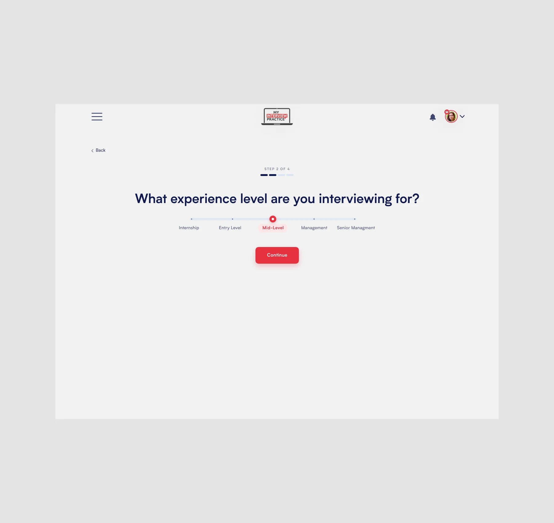
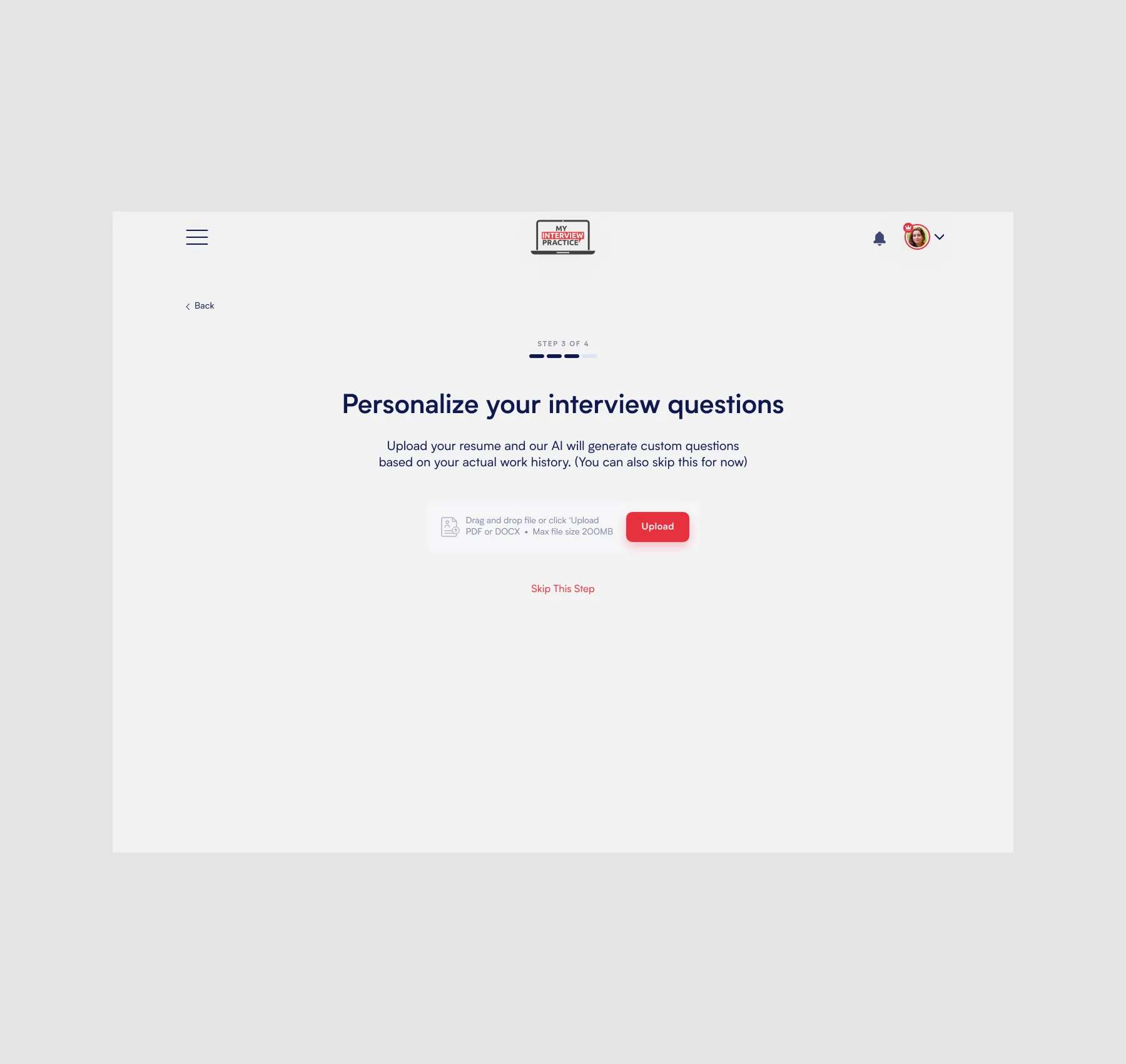
The onboarding flow was redesigned to feel more guided and momentum-driven, reducing cognitive load while creating a clearer path toward action. Interview setup flows were simplified, dashboard experiences became more focused, and recommendations were structured around helping users immediately understand where to begin.
The hypothesis was that reducing friction during the earliest moments of the product experience would improve activation, increase engagement, and help users better connect with the platform’s core value before being exposed to deeper features and customization.
If we guide new users toward their first interview through a simpler, more structured experience, they’ll understand the value of My Interview Practice faster — and be more likely to continue using it, upgrade, and build confidence through repeat practice.
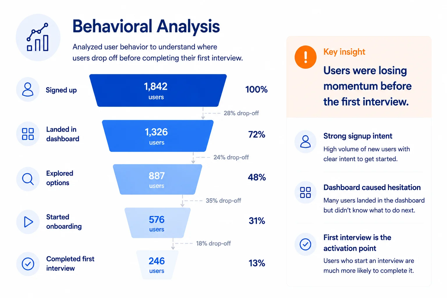
Users who completed their first interview were far more likely to continue exploring the platform and understand its value. Reaching that first completed interview became the key activation moment — and the main friction point we needed to design around.
If we guide new users toward their first interview through a simpler, more structured experience, they’ll understand the value of My Interview Practice faster — and be more likely to continue using it, upgrade, and build confidence through repeat practice.
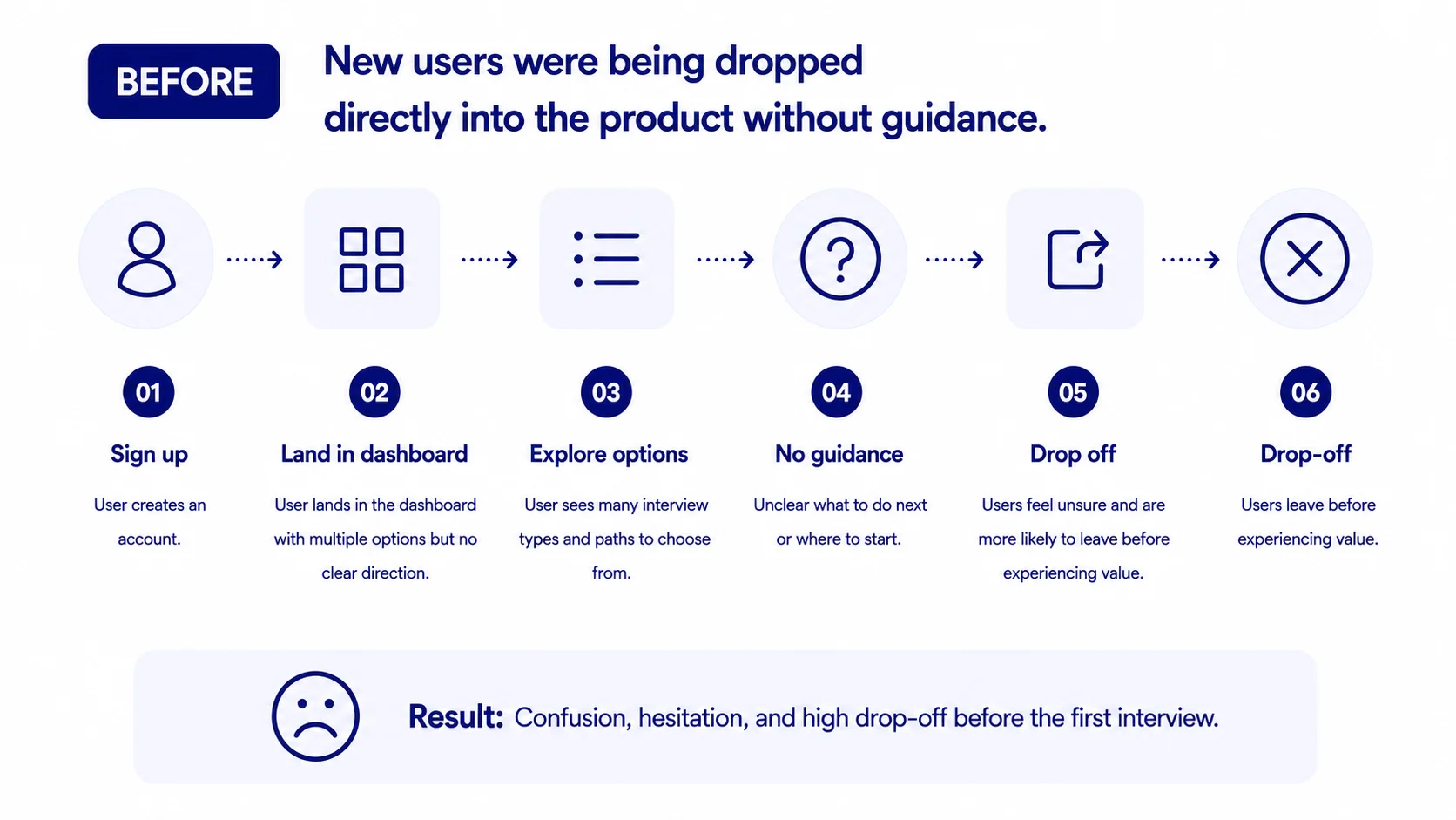
Behavioral analysis and session recordings revealed that many new users were entering the platform with interest, but struggling to confidently begin their first interview experience. Users were often presented with too many decisions early in the journey, creating hesitation during the most critical stage of onboarding.
Session recordings also showed that users who successfully completed an interview were significantly more likely to continue exploring the platform, engage with additional features, and better understand the product’s long-term value.
This shifted the focus of the redesign toward reducing early friction, simplifying onboarding decisions, and guiding users toward their first successful interview as quickly as possible.
.webp)
.webp)
The core question was: what experience would most reliably take a new user from “I signed up” to “I understand how this helps me prepare”?
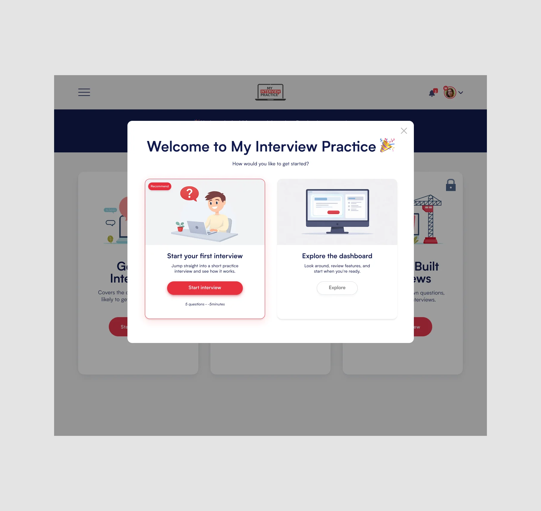
We explored ways to guide users toward the platform’s key activation moment: completing their first interview. The goal was to reduce hesitation, simplify decisions, and help users experience value before asking them to explore every feature.
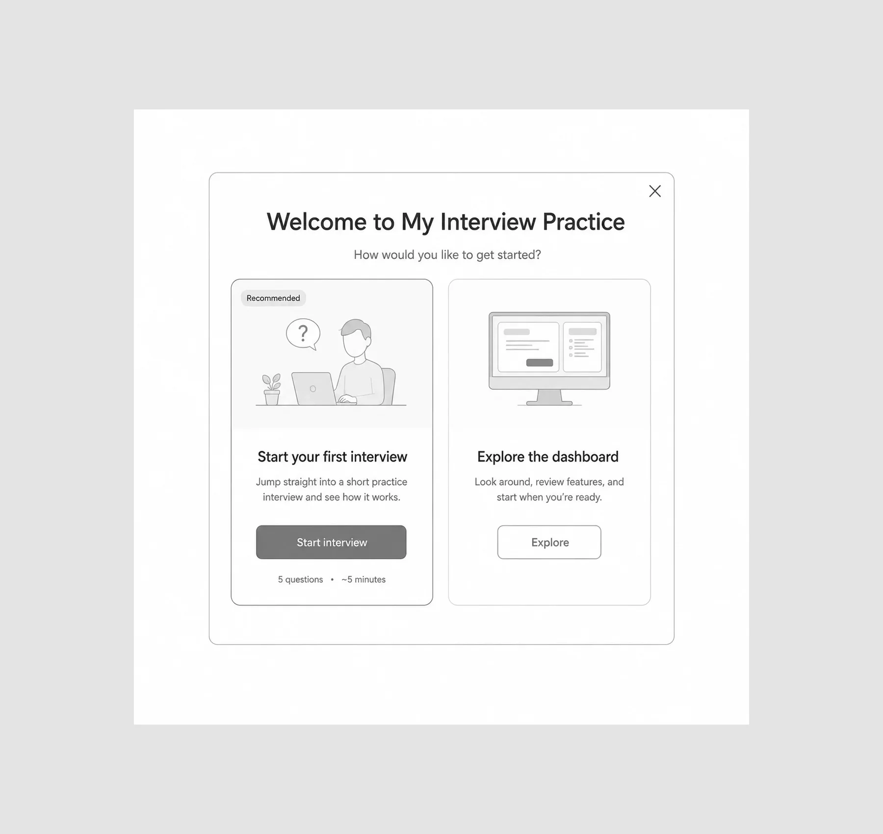
Before landing on a more guided onboarding direction, we explored several approaches: welcome modals, simplified interview selection flows, personalized dashboard prompts, and shorter warm-up interview concepts.
The key constraint was that onboarding needed to guide users without slowing them down. It had to help first-time users understand where to begin, while still letting returning or confident users move quickly through the product.
That ruled out anything too heavy or overly instructional. What remained was a lighter onboarding experience: clearer first steps, focused dashboard prompts, simplified interview setup, and recommendations that guided users toward a first interview without overwhelming them.
.webp)
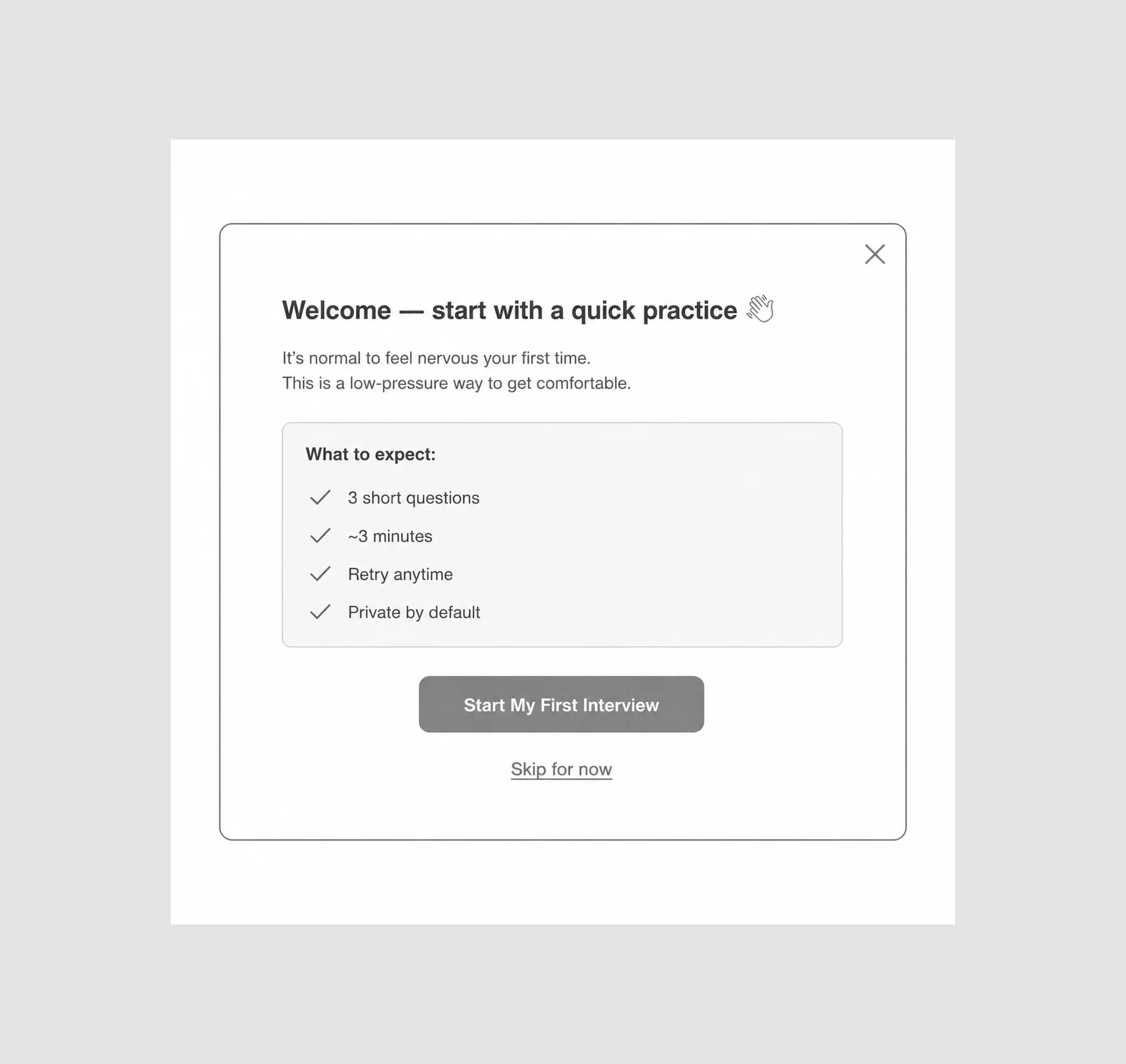
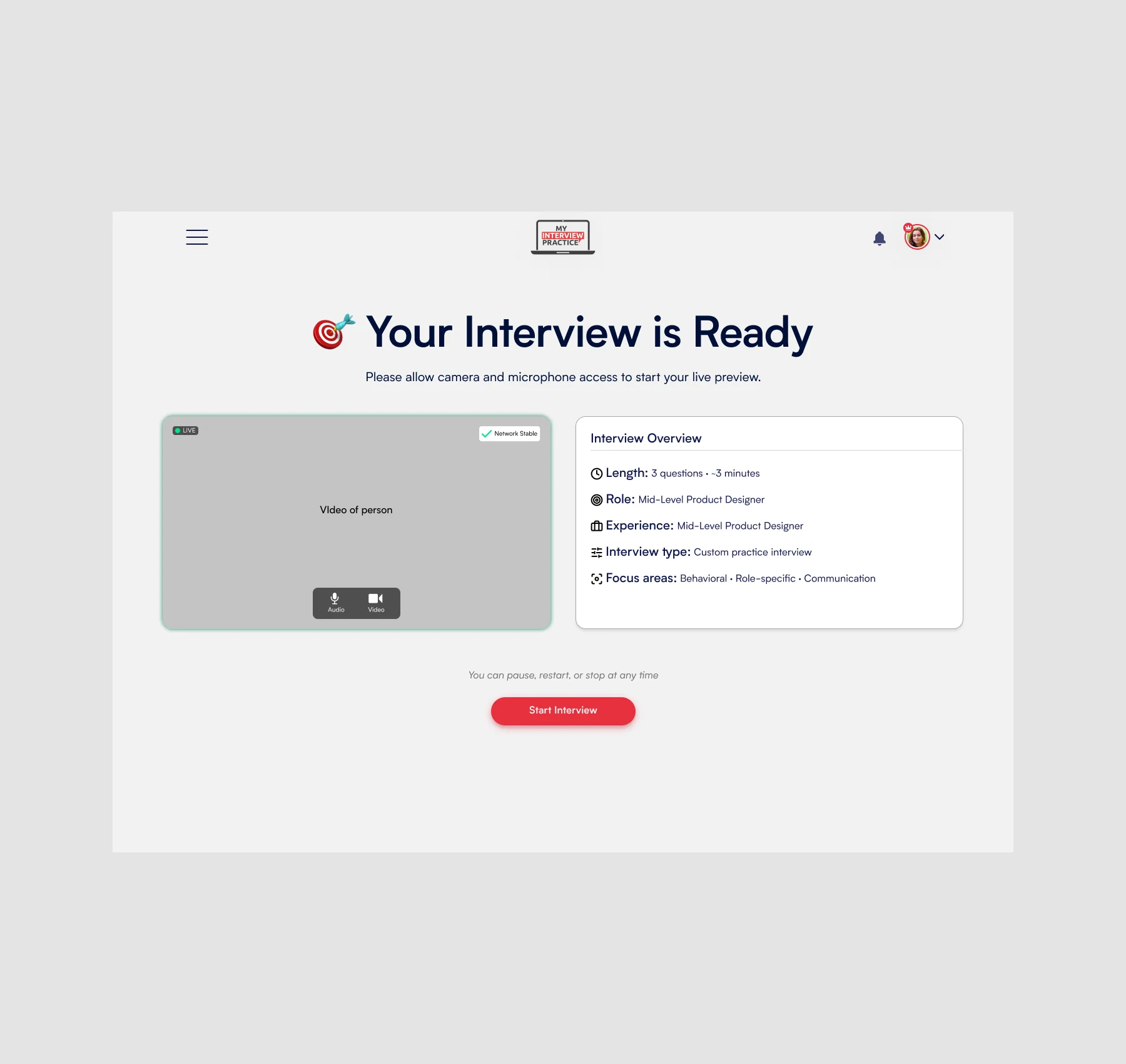
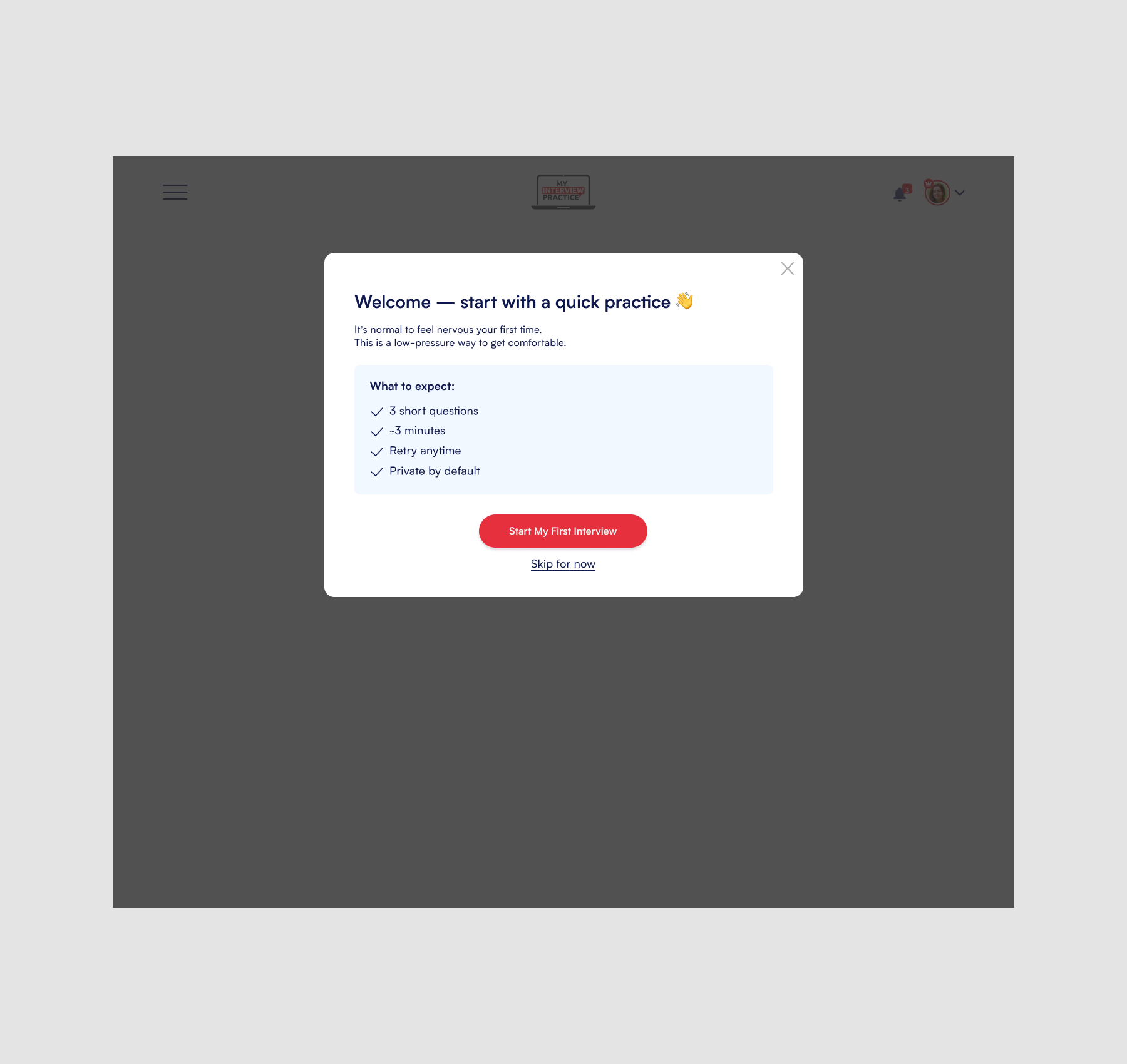
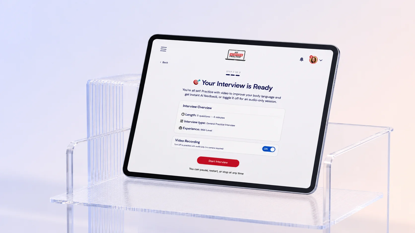
The final direction focused on creating a clearer path from signup to first interview. Instead of presenting every interview type and feature upfront, the experience guided users toward the action most likely to help them understand the product’s value: completing an interview.
The redesigned flow helped users choose an interview path, move through setup with less friction, and land in a dashboard experience that made the next step feel obvious. It was designed to support activation without blocking exploration.
.webp)
This project reinforced how important it is to guide users toward value before asking them to fully explore a product. Instead of overwhelming users with options upfront, the redesign focused on reducing friction, simplifying decisions, and helping users build confidence through action.
By designing onboarding around activation rather than feature exposure, the experience became more approachable, more focused, and better aligned with how users naturally build momentum inside a product.
The project also highlighted the importance of balancing guidance with flexibility — creating an experience that supports first-time users without limiting deeper exploration for more engaged members.
.webp)