
.svg)
The client, DiceMag Media, is a creative specialist with over 20 years of experience helping brands grow through tailored strategies and global connections. They approached me to design and develop a new website that would better reflect their expertise, personality, and positioning in the media space. This case study presents a comprehensive overview of the process, challenges, and solutions involved in bringing their new digital presence to life.
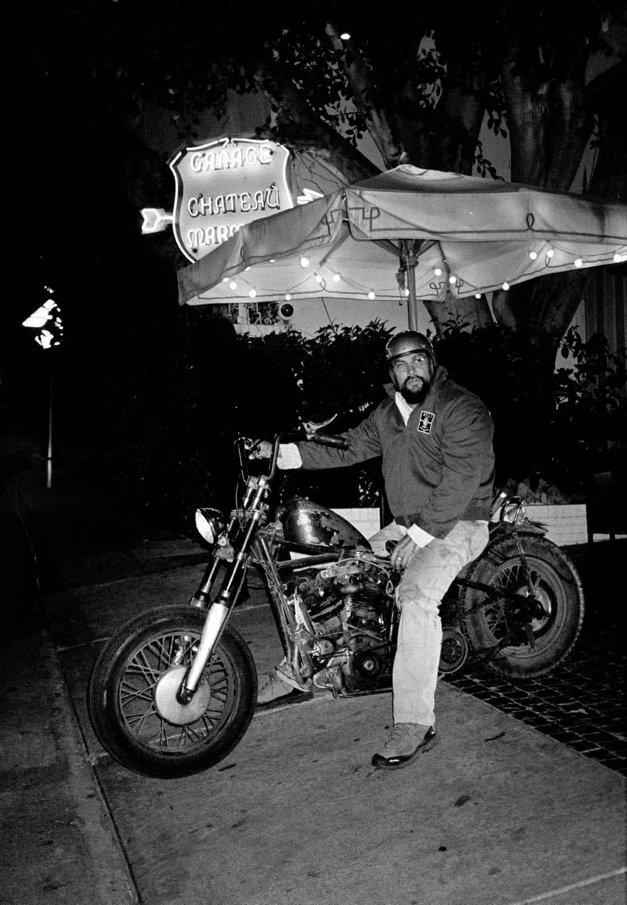
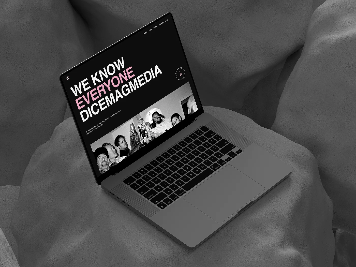
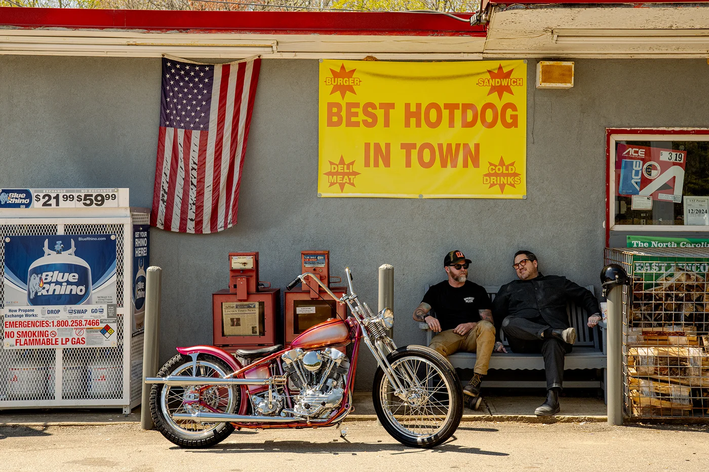
DiceMag is known for its unapologetically bold voice and cultural edge, so the biggest challenge was translating that same energy into a digital format. The goal wasn’t just to design a clean, functional site—it had to feel like Dice. Every visual and interaction needed to reflect the brand’s personality: confident, creative, and always ahead of the curve. Striking that balance between expressive design and intuitive usability was key to bringing their vision to life online.
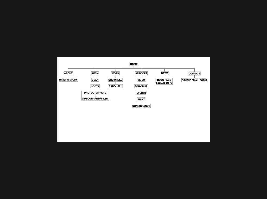
With no previous website to build from, one of the first major challenges was establishing a clear structure for the site. This meant creating everything from the ground up—user personas, journeys, sitemap, and content hierarchy. The goal was to design an experience that felt both intentional and intuitive, even without a large amount of content to start with. Every page, section, and flow had to be purposeful, scalable, and aligned with DiceMag’s bold brand voice from the very beginning.
One of the biggest challenges was making sure the site felt as bold and expressive as the DiceMag brand—without sacrificing ease of use. I wanted the site to feel dynamic and engaging, so I used subtle animations to bring movement and energy to key sections. At the same time, it was important that visitors could quickly understand who DiceMag is and what they offer. I kept the layout clean and the navigation intuitive, making sure their services were front and center, while still leaving room for personality and visual flair.

To capture the brand’s bold, editorial vibe, I used large typography, high-contrast visuals, and an whitespace. Their preferred colors became the foundation, and I layered in texture, subtle motion, and on-brand imagery to create a digital experience that felt distinctly Dice. Animations—created using tools like Jitter and Webflow’s native interactions—helped bring the site to life without overwhelming users, adding just the right amount of energy and personality.
With no existing website or structure to reference, I kicked off the project by defining user personas and mapping out potential user journeys. Using Figma, I created a detailed sitemap and wireframes that aligned with DiceMag’s content needs and brand goals. Moodboards helped set the creative tone early, ensuring visual alignment before moving into high-fidelity design. This structured approach allowed us to move confidently into development with a clear blueprint.
Balancing bold design with functionality was key. I built a clean, intuitive layout that showcased DiceMag’s services while still leaving space for creativity and experimentation. The site was developed entirely in Webflow, ensuring smooth responsiveness across devices. Animations and transitions were used sparingly and with purpose. To keep the site fast and optimized, I used image and video compression tools throughout, making sure that media-rich sections loaded quickly without compromising quality.
.webp)
%201.webp)
This project was all about turning DiceMag Media’s bold personality into a digital experience. From early ideas to final launch, I handled everything—from structure and design to development—using tools like Figma, Webflow, Jitter, and Adobe. The result is a clean, expressive, and easy-to-use site that feels true to the brand and ready to grow with it.
.svg)