
.svg)
Turning first-time users into active members
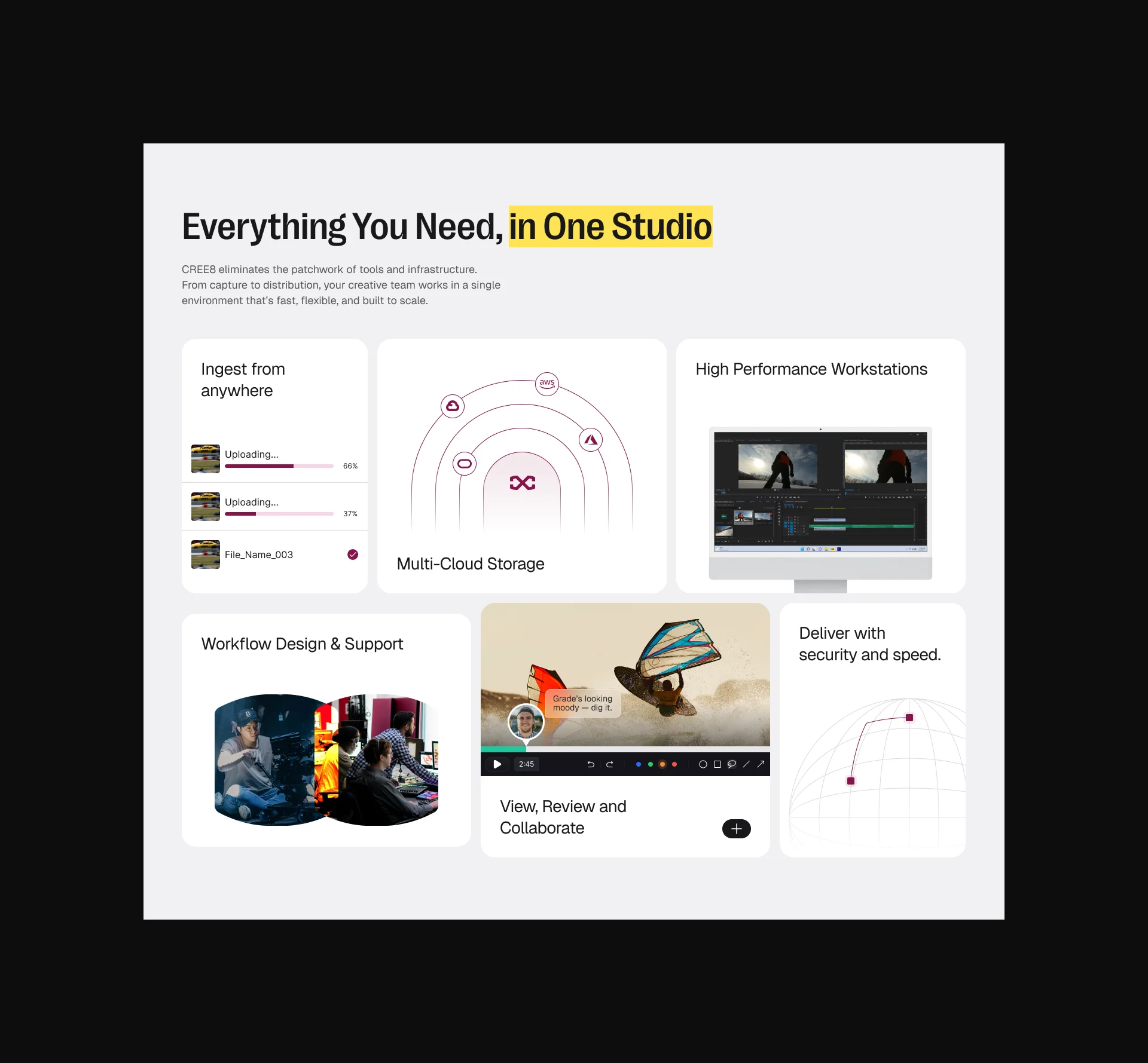
CREE8 brings together multiple tools and workflows into one connected platform for modern production teams. The challenge was presenting a broad set of capabilities in a way that felt clear, modern, and easy to understand without overwhelming visitors or relying on overly technical language.
The website also needed to speak to two audiences at once: creative teams looking for speed, flexibility, and seamless collaboration, and business buyers looking for security, scalability, and reliability. The experience had to capture the energy of modern creative production while still feeling polished and credible enough for a serious B2B platform.
Beyond improving clarity, the redesign needed to create stronger paths to action. This meant improving content flow, making calls to action more visible, surfacing value earlier, and introducing stronger trust signals so visitors could confidently book a demo, get in touch, or continue exploring the platform.
View Website.webp)
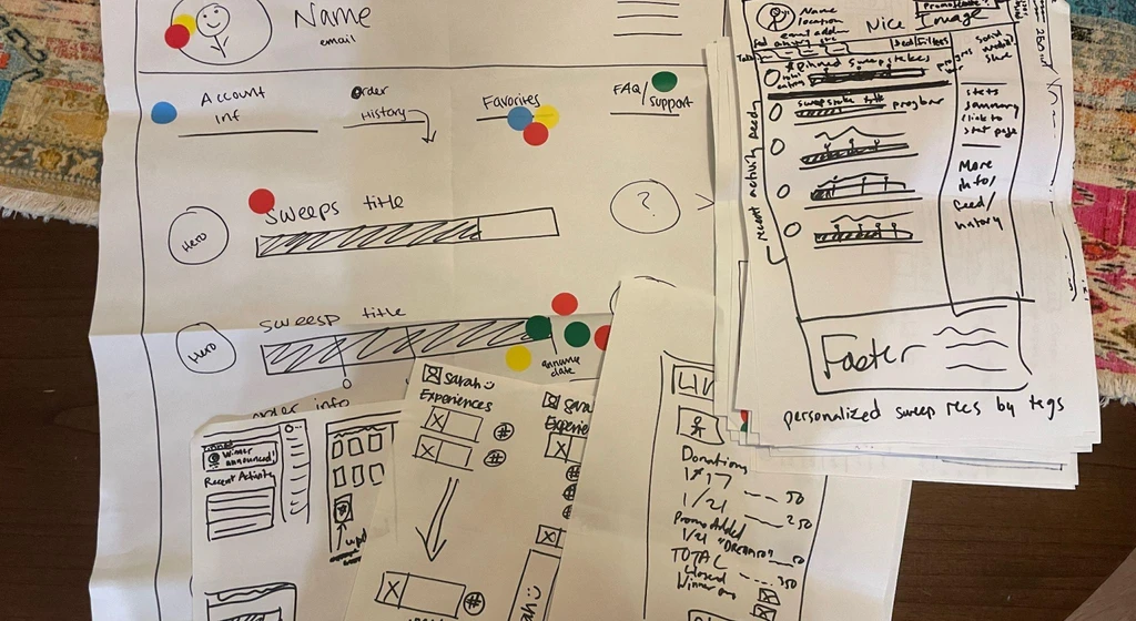
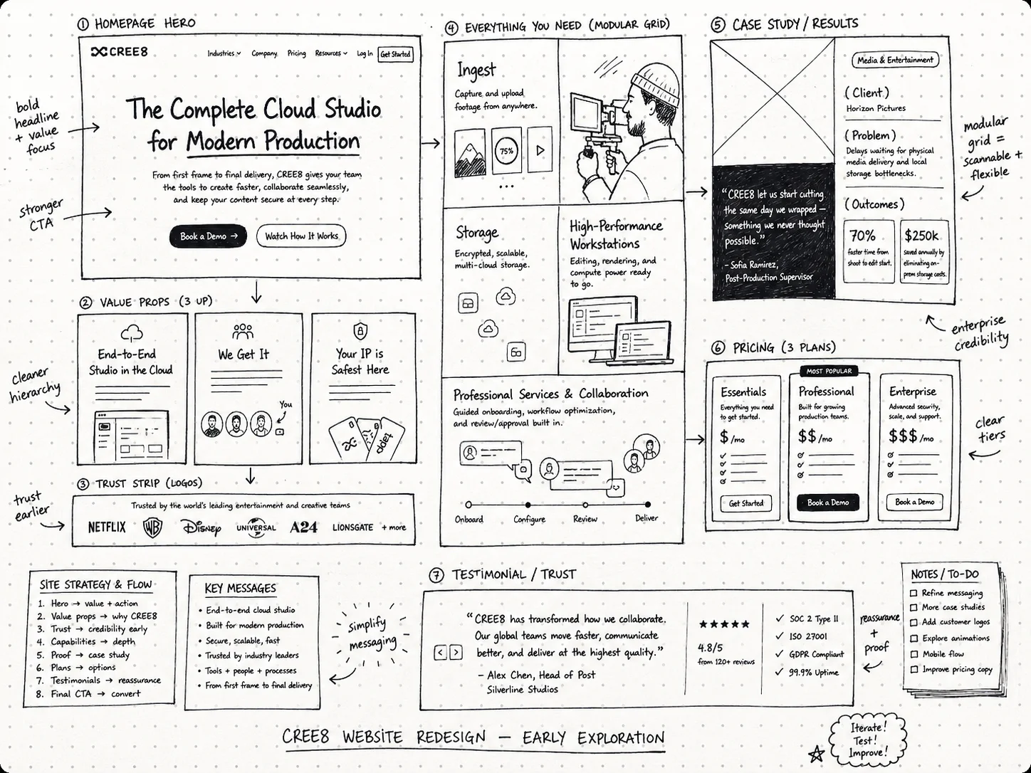
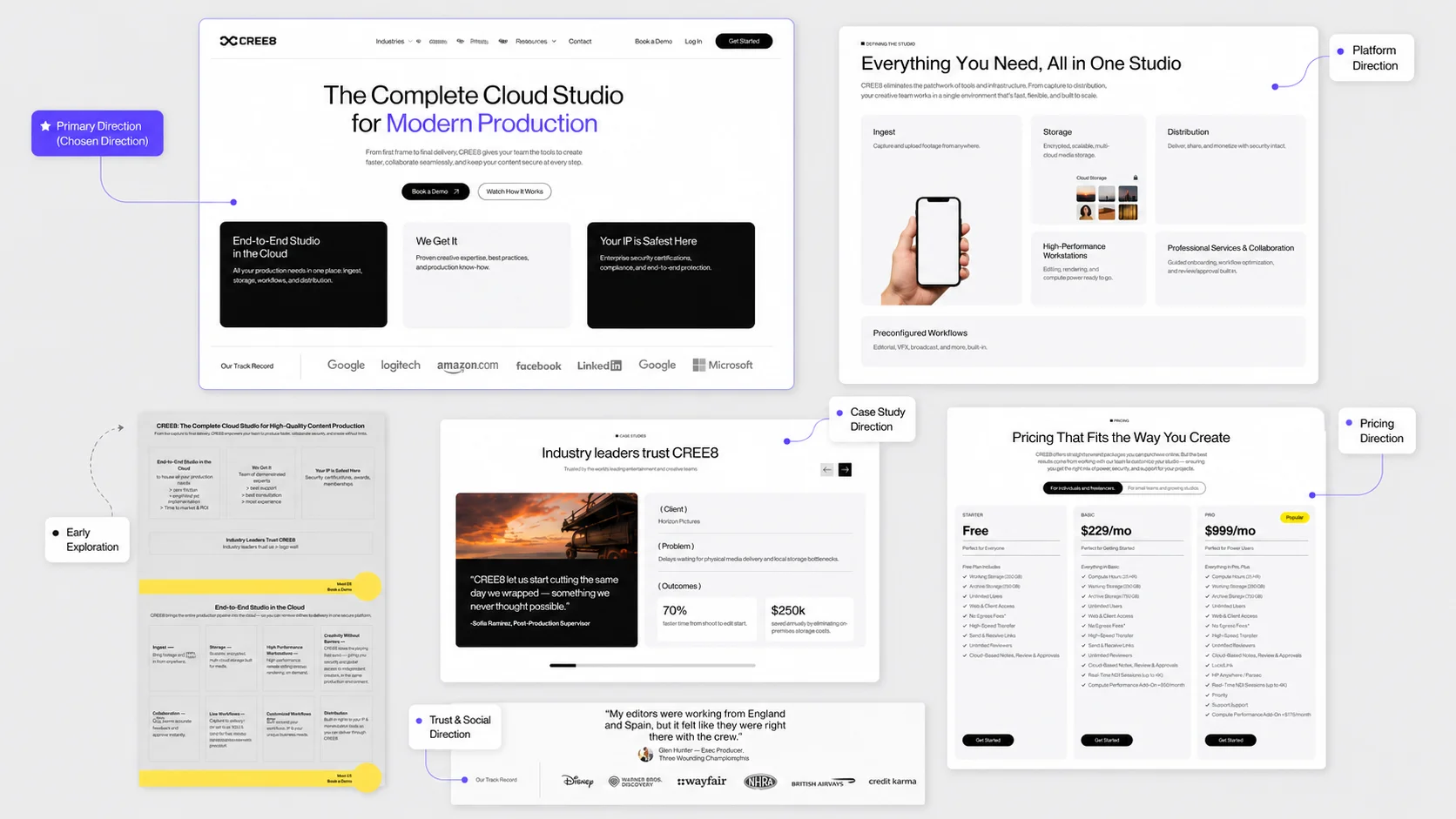
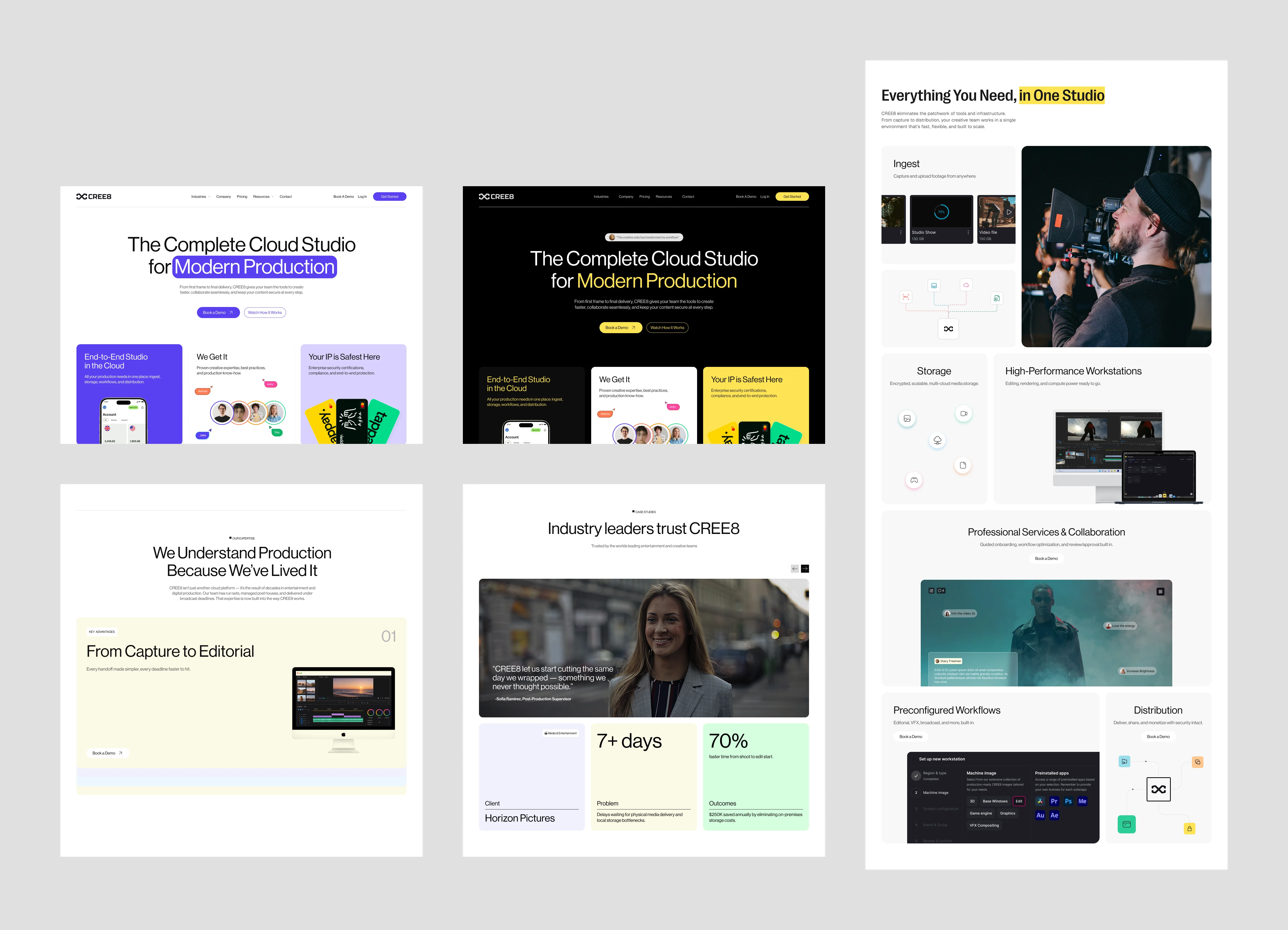
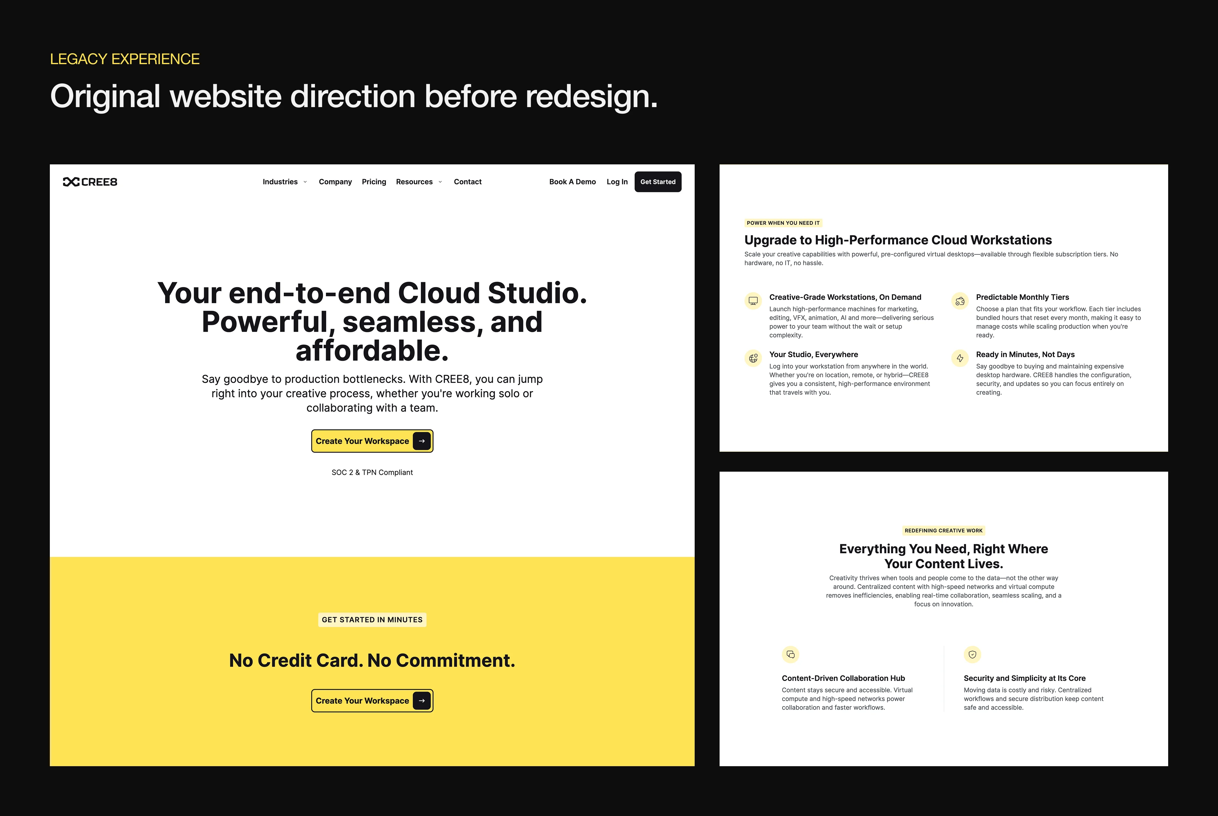
The exploration phase focused on finding the clearest way to communicate CREE8’s value across the homepage. Because the platform serves both creative production teams and enterprise buyers, the page needed to explain the product quickly while still building trust throughout the experience.
I explored multiple homepage structures, hero directions, bento-style product modules, case study placements, pricing sections, and CTA patterns. Each iteration tested how the story could move from product clarity to credibility to action without overwhelming visitors with too many features at once.
This process helped shape a homepage flow that felt more intentional: introduce the platform, prove its value, explain the workflow, build trust, and guide visitors toward booking a demo.
.webp)
%20(3).webp)
.webp)
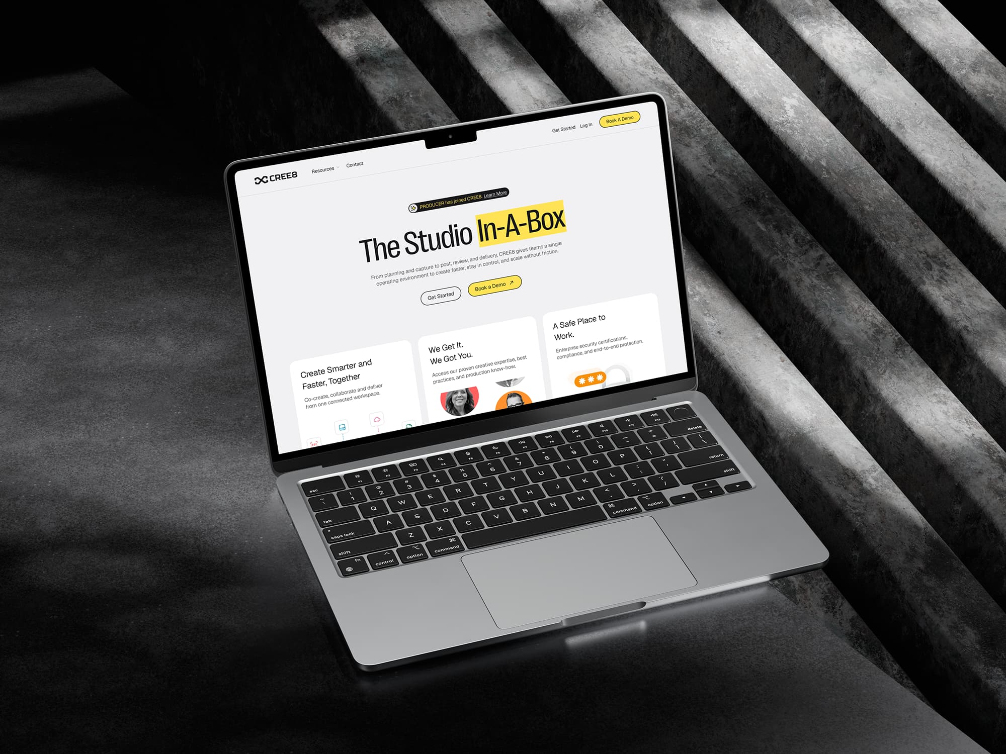
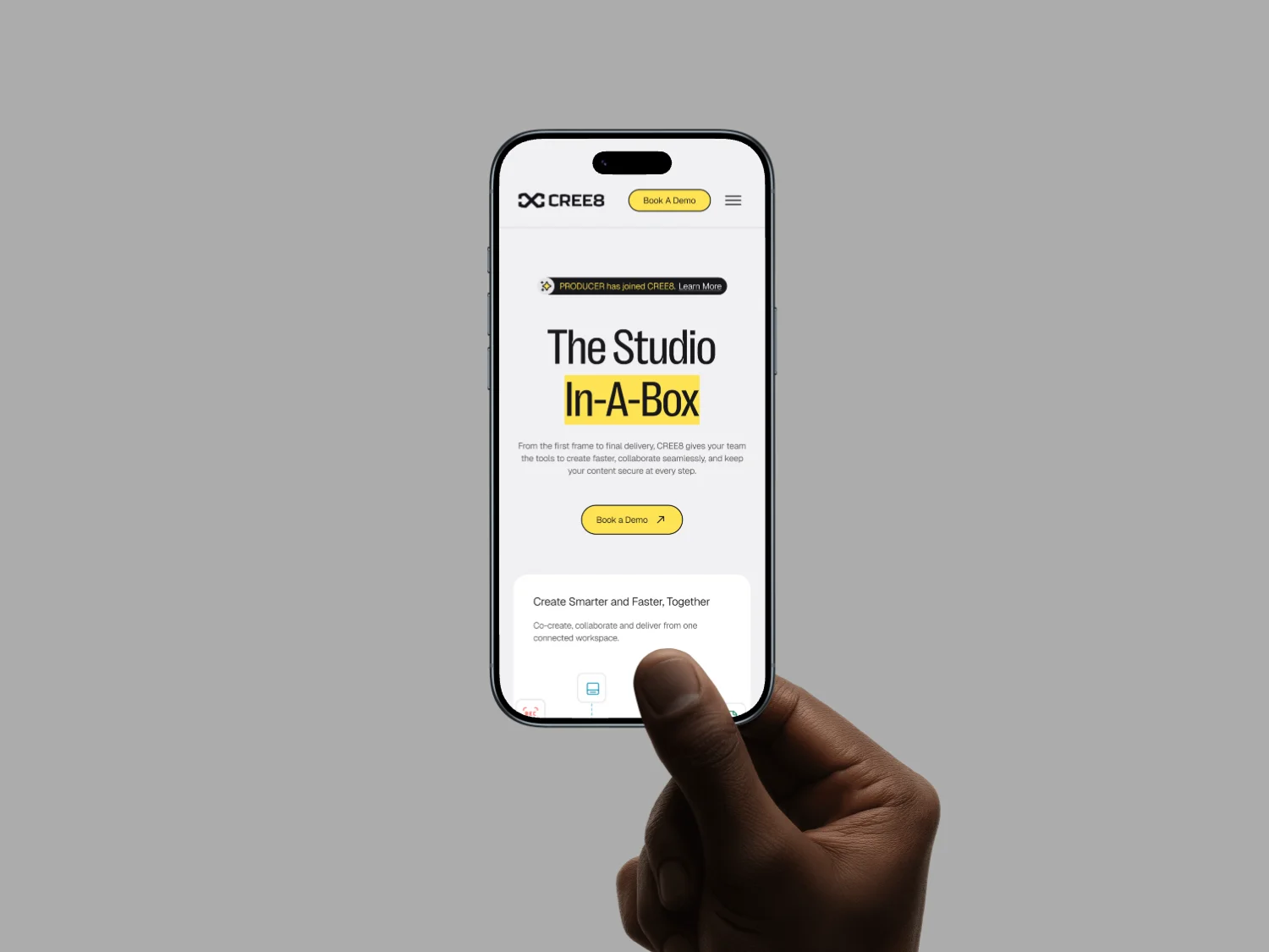
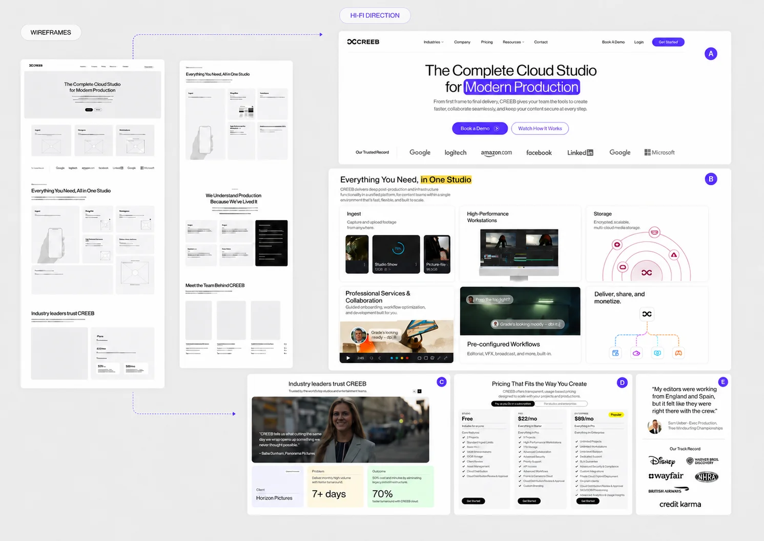
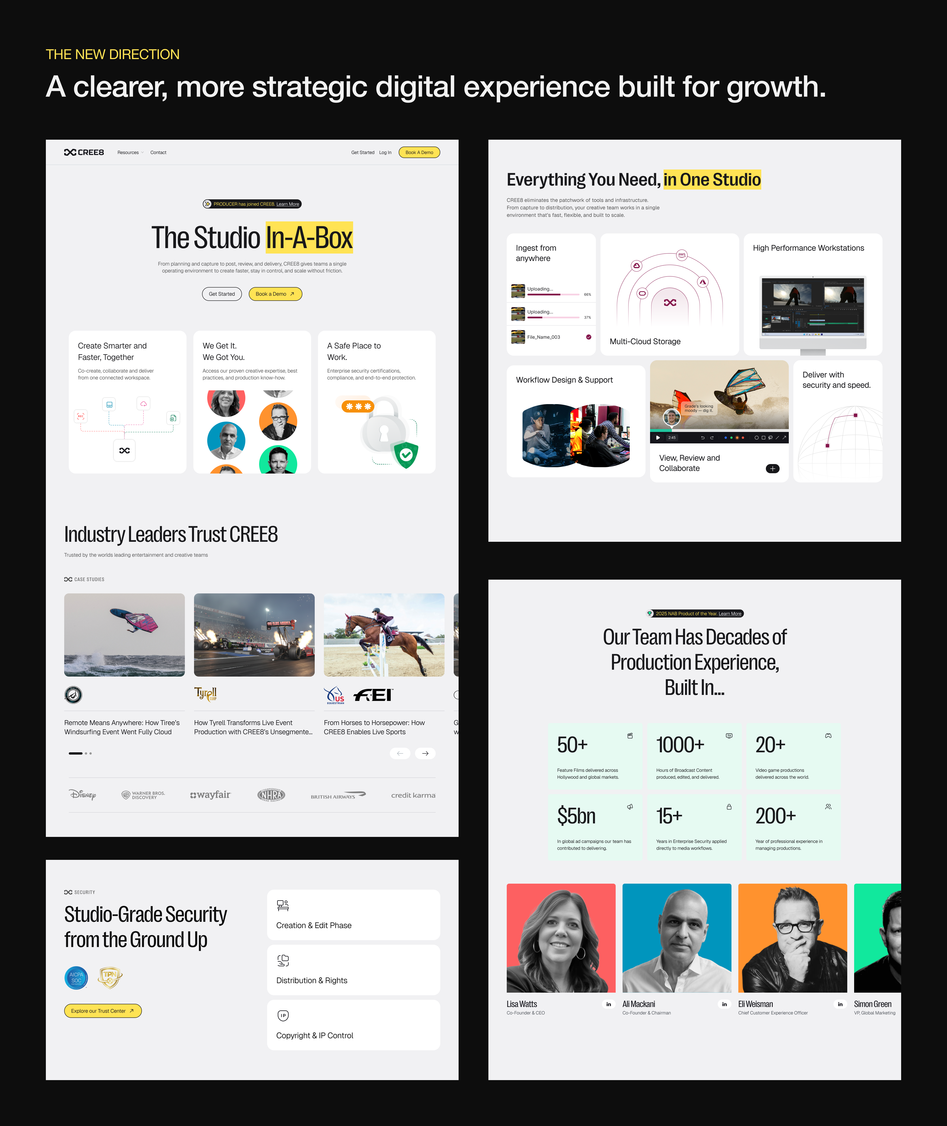
The final redesign focused on turning CREE8’s homepage into a clearer and more persuasive introduction to the platform. Instead of overwhelming visitors with a broad set of capabilities, the new direction structured the page around clarity, trust, and action — helping users quickly understand what CREE8 does, who it serves, and why it matters.
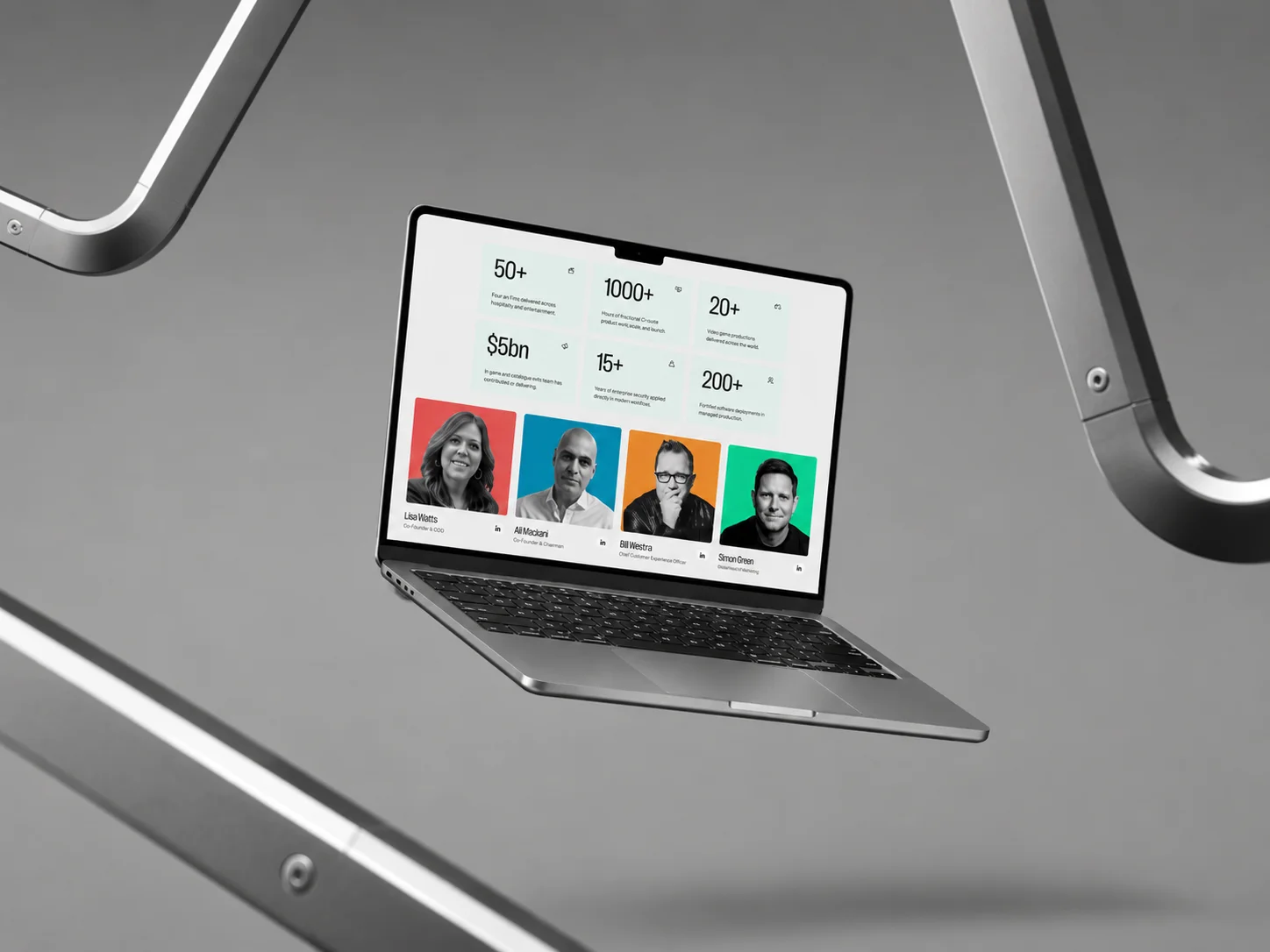
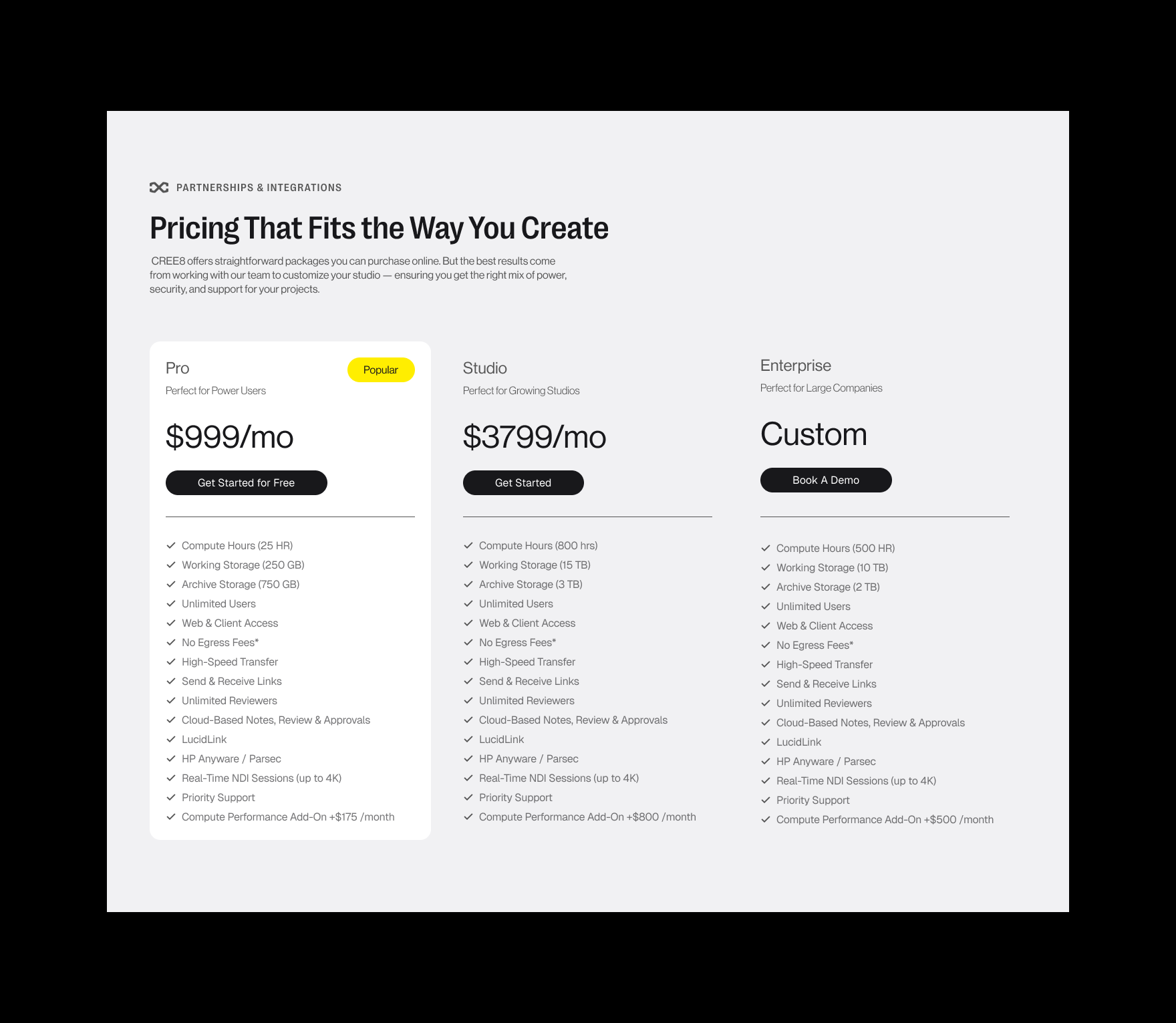
The homepage was redesigned to guide visitors through a stronger decision journey: a clearer hero message, product storytelling, trust-building sections, case studies, testimonials, pricing visibility, and more purposeful calls to action. Each section was designed to support credibility and help visitors move naturally from interest to deeper exploration.
The result was a more focused SaaS homepage that balanced creative energy with enterprise credibility, giving CREE8 a stronger digital presence and a clearer path from product understanding to action.
CREE8 partnered with me to elevate their website and better position the platform for creative teams and enterprise clients. The goal was to create a stronger sense of trust, clarify the product offering, and improve conversion opportunities.
I helped redesigned the site with a modern aesthetic focused on messaging clarity, user flow, and strategic visual direction. This included refining typography, layout structure, and color to create a more premium and effective experience. The result was a stronger digital presence aligned with CREE8’s growth and future vision.
CREE8 brings together multiple tools and workflows into one connected platform for modern production teams. The challenge was presenting a broad set of capabilities without overwhelming visitors or relying on overly technical language. The website needed to quickly communicate what the platform does, why it matters, and how it creates value in a way that felt clear, modern, and easy to understand.
CREE8 is built for fast-moving creative teams that need speed, flexibility, and seamless collaboration, while also needing to earn the trust of larger organizations focused on security, scalability, and reliability. The challenge was creating an experience that spoke to both audiences at once—capturing the energy of modern production workflows while still feeling polished, credible, and professional enough for a serious B2B platform..
One of the main challenges was improving how the website converted interest into action. The experience needed clearer calls to action, stronger content flow, and a structure that naturally guided visitors toward the next step. It was also important to introduce stronger social proof to build trust early and reinforce credibility. The goal was to reduce friction, surface value sooner, and make it easier for users to book a demo, get in touch, or learn more with confidence.
The redesigned experience focused on making the platform easier to understand from the very first interaction. Messaging was reorganized to quickly explain what CREE8 does, who it’s for, and why it matters—turning a broad set of features into a clearer and more compelling story.
The new visual direction was designed to feel both creative and credible. Cleaner layouts, stronger hierarchy, refined typography, and trust-focused sections helped create a more polished experience for creative teams while still feeling professional enough for enterprise buyers.
The user flow was reworked to guide visitors more naturally through the site and toward action. Calls to action were made more visible, value was introduced earlier, and social proof was added throughout the experience to build confidence and encourage demo inquiries.
.png)
My collaboration with CREE8 redefined their digital presence by combining strategy, clarity, and conversion-focused design. The new site not only elevated the brand visually but also simplified a complex platform into a clearer and more compelling story for both creative teams and enterprise buyers. With stronger messaging, trust-driven sections, and a more strategic user flow, the website is now a stronger platform for growth, credibility, and action.
.svg)